Bitching about UX for the win!
I recognize fully I’m entering the “glass house/stone throwing” zone by enumerating UX criticisms when my website isn’t exactly perfect but hey, two months ago I finally made it mobile-friendly after a decade of holding out, so there’s that. Right?
Right?
Anyway, after I clicked on my eight millionth “We respect your privacy, review all the ways we invade your privacy” GDPR compliance popup, I felt like the Internet needed my Modest Proposal. Or, at the very least, to hear my airing of grievances.
These are my picks for the most annoying trends in website and app design right now…
11 | Ordering content algorithmically without an option to do so chronologically
The social networks are universally determined not to show us things in the order they were posted. Rather, they’d exponentially prefer to show us the posts getting the most engagement, which basically fall under two umbrellas: (1) baby/wedding/moving announcements and (2) posts from the Russian government posing as groups with names like Guns Forever Obama Is Kenya Texas Texas Texas.
It’s especially maddening when, as on Instagram, there’s not even an option to force the app to go chronologically. Instead, when we see someone who’s made multiple posts from an event, they come in non-sequential order and we have to figure out what’s going on like it’s Pulp Fiction.
10 | “Please whitelist us” advertising pop-ups

The latest salvo in the ongoing cat-and-mouse game between ad blocking and web publishing has taken this turn. And I get it — publishers need the ad revenue (I certainly appreciate the little trickle I get) so if you want to block their ads, they’ll do something even more annoying and have a pop-up asking you not to block their ads.
But here’s my feeling on it: Go all the way or not at all. A pop-up asking to be whitelisted that can be dismissed is just annoying. Either ban me from reading the content unless I whitelist your ads, or don’t bother. The “please whitelist us” roadblock is like getting half pregnant.
9 | Infinite scrolling that prevents you from getting to the footer
I like website footers. They’re usually the most reliable place to find well-organized links to key parts of a website (and also to find the RSS links, which are now buried treasure the likes of which ye have never seen). So the websites that infinitely scroll and make it impossible to get to the footer frustratingly take away that one simple, organized compendium of usefulness.
8 | A mobile version of the site that can’t do the key functions of the regular website
I waited a long, long time to have a mobile-friendly version of this website. It took me almost a decade. And the main reason was: I didn’t like mobile websites that weren’t as functional as their desktop version. My wife and I have had a conversation countless times when one of us is trying to do something on our phones that ends with, “Just do it on a computer where it’ll actually work.”
For my website, I waited out years and years of bad mobile design until responsive design (the same website, just intelligently growing or shrinking based on screen size) became totally viable. And then I waited like three or four more years after that, primarily out of laziness.
7 | Design that’s more “pretty” than functional

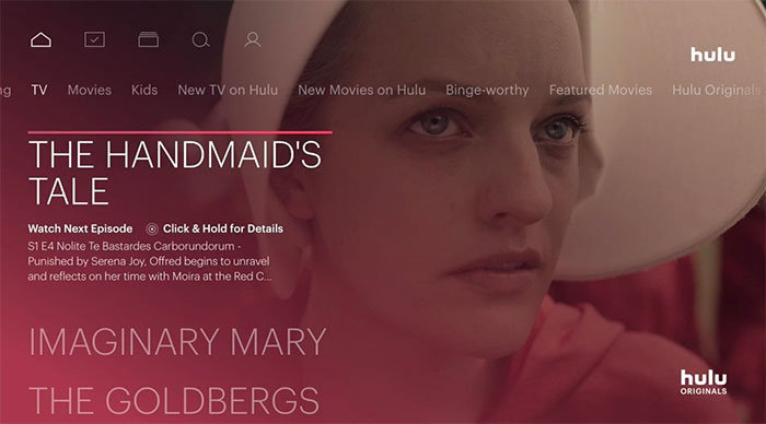
Hulu’s Apple TV app looks pretty good — bold colors, modern fonts, lovely full-screen photos for every show. It’s also unusable junk. Watching one of your shows takes at least four or five careful, precise swipes and clicks. (And even then, clicking on the wrong thing or swiping to the wrong section happens at least a quarter of the time.) Hulu’s decision to go this route is surprising, because their other apps and their website have the best organization and flow of any of the streaming services.
The “design over function” issue also happens with a lot of apps, but in the opposite way. Hulu chose to overcomplicate things; other apps have chosen to uncomplicated things to such an extent that they inadvertently become complicated. In their quest to look slick and minimal, they require lots of guessing on what various icons mean or what swipes will do. Although I ask myself daily if I find Snapchat confusing because it’s too minimal, or because I’m too old.
6 | Asking to send browser notifications

Browser notifications could’ve been number one on this list, as they’re not just terrible, but unnecessary. I’m not even sure what they are, but I’m damn sure I don’t want them. Various websites will ask if they can send you notifications, and they do so with a special pop-up that prevents you from scrolling, clicking or doing anything else.
The answer is no. You can’t send browser notifications. The answer is always no. No one in history has been on Yahoo and thought, “You know what, yes. Yes I do want Yahoo to send me browser notifications, whatever those are.”
5 | A pop-up that points out you’ve blocked notifications
Even worse than asking to send notifications? A subsequent pop-up that blocks all actions reminding you that you’ve blocked notifications and checking if you’ve changed your mind.
The answer is no. I still don’t want your browser notifications. The answer is always no. No one in history has been on Yahoo and thought, “You know what, I initially thought I didn’t want Yahoo to send me browser notifications, whatever those are, but I’ve changed my mind thanks to zero evidence and now I do want those.”
4 | Abandoning all written content to “pivot to video”
The three most dreaded words on the Internet right now are “pivot to video.”
Content companies have found themselves in a difficult situation. The advertising rates on video are multiples higher than the advertising rates on display ads that run against written content. So, naturally, many a company concludes that more video and less writing is the answer.
But it’s not the answer, because everyone hates video. I mean, people like video on their own terms. But basically everyone looking at a content website at their office, in a waiting room, on a train, on the couch, at the dinner table, or almost everywhere else — yeah, they want to read. Words.
FoxSports.com famously pivoted totally to video last year and their traffic reportedly dropped 88 percent, from 144 million pageviews a month to 16.7 million.
So what is the answer? Someone’s going to figure out a better way to monetize the stuff people actually want to read one day, and that someone’s going to be the world’s first trillionaire. Until then, though, “pivot to video.”
3 | Autoplaying video

And it’s even more maddening when the video shrinks into a little window in the bottom right corner of the screen when I frantically scroll down to get away with it.
2 | Autoplaying video with sound
I’ve tried basically every browser extension that promises to stop video autoplay. I’ve disabled Flash. And yet, websites still manage to start clucking at me on a daily basis. And the publishers are definitely winning this cat and mouse game right now. In a recent update, Chrome introduced an autoplay blocking feature — but then had to disable it because it was messing with other web apps like games.
1 | Autoplaying video with sound featuring a random twentysomething standing in front of a green screen talking about the biggest trend of two weeks ago
“Yanny or Laure–”
And I’m already gone.
