Sometimes a headline and photo or ad really should not be next to one another.
I had to look through, like, SO much microfiche to find these.
1 | Got stumps?
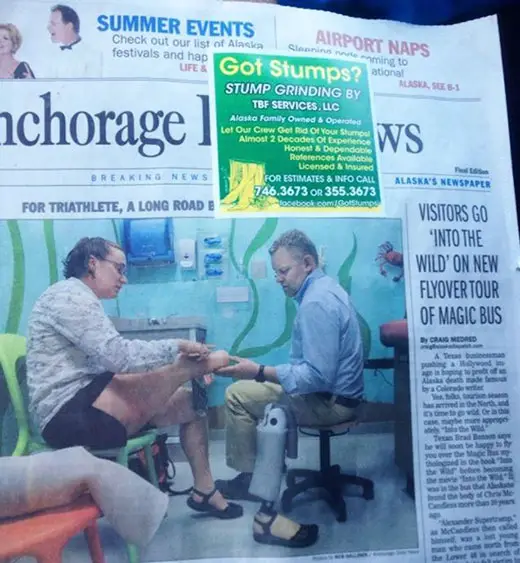
Of all the days to advertise on the front page, they had to pick the one with a giant photo of an amputee. Plus they’re blocking that hot hot teaser about “Airport Naps”; not a banner day for TBF Services and their stump grinding.
2 | Having a blast
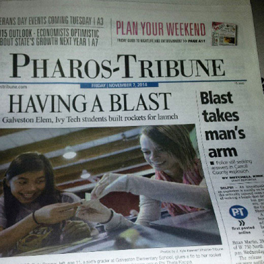
This is particularly egregious, since the same word shouldn’t appear in adjacent headlines in any situation — regardless of its accidental implications.
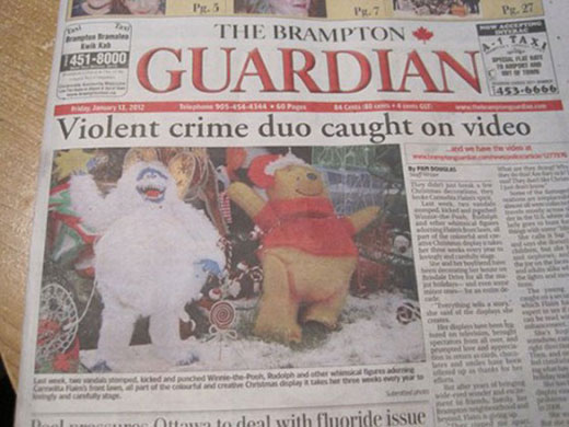
3 | He doesn’t look that violent
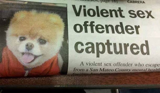
Then again, I have two small dogs who are notorious for both (1) sporadic calf humping (calf meaning human calves, not baby cows) and (2) um… how to put this… marathon sessions of self-fellating. Still, I don’t think they should be taken off the streets.
4 | These two, on the other hand?
Blatant menaces to society.
5 | The Boy Scouts acceptance strategy
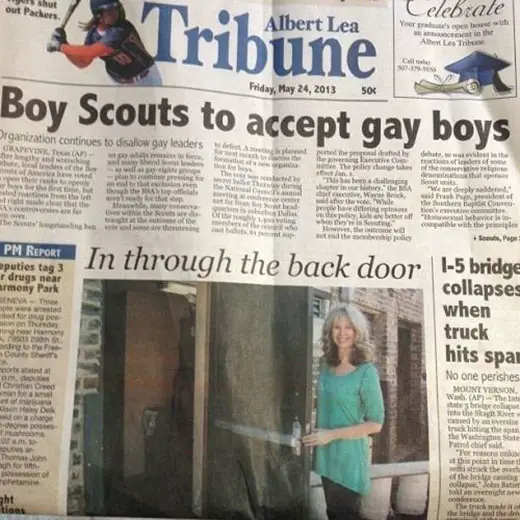
Well. Someone’s not getting their merit badge in headline writing.
6 | Clubland Murder Charges
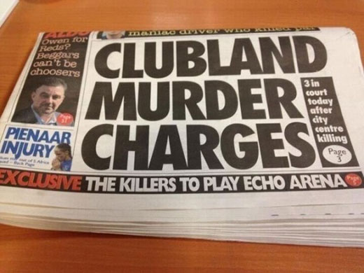
Has anyone investigated if they were also responsible for the Dead Kennedys?
7 | Tickets to the gun show
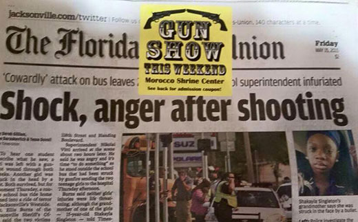
More surprising than this awful sticker placement? That someone in Florida actually realized this wasn’t cool and took a picture.
8 | Farewell from the senior staff
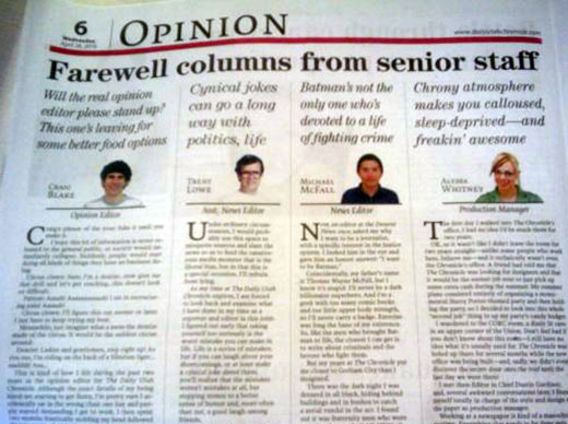
Odds this was an accident? I think I could get equal action on an over-under of 25 percent.
9 | Yo, Adrian
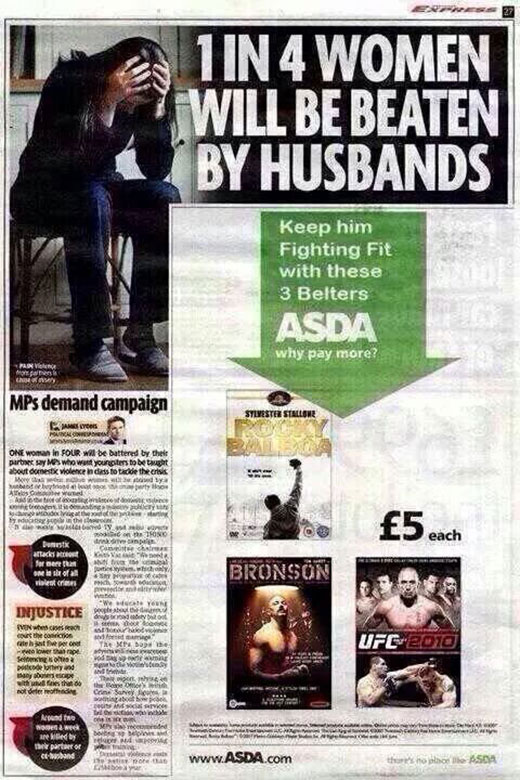
This disaster of a headline/ad juxtaposition could’ve been avoided just by employing even a tiny modicum of design sensibility. Who lays out a page like that?
10 | Nude girl causes scene on campus
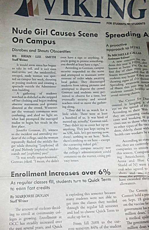
If this picture were taken from a slightly different angle, not only would the nude woman have driven up enrollment, but she also would’ve been spreading swine flu.
11 | Widow wins the right
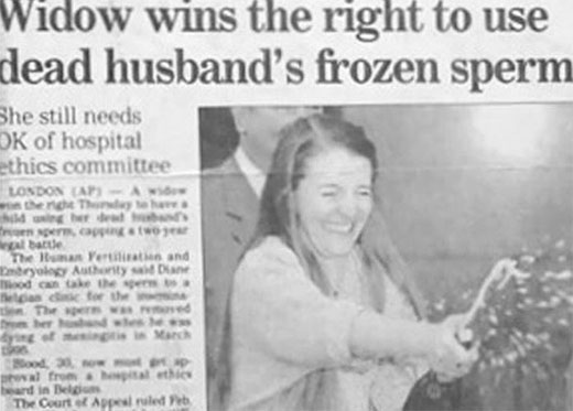
Hey, when a celebration breaks out, shake ’em if you got ’em.