Brilliantly bad sports posters peaked in the early ’90s. So did the NBA. Here’s what happened when they collided.
Back in October, during World Series-ish time, I did a list of 11 ridiculous Major League Baseball posters. Most of them were from the early ’90s and most were produced by a company called Costacos Brothers. Their trademark style (especially in the late ’80s and early ’90s) was to dress players up in awkward costumes and photograph them in low-budget scenarios loosely related to their name or nickname. The result was an unintentional corny brilliance, kind of like squeezing a piece of coal until it turned into a diamond shaped like Rita Rudner.
I wanted to follow up by doing a similar list of NBA posters. And since the NBA playoffs seem to be headed toward their inevitable conclusion (one I choose not to abide by watching), it’s time to roll this out.
Here are 11 surreal, mind-boggling NBA posters that belong in the Basketball Hall of Fame. Or at least on the wall of a nicer Dave & Busters.
1 | Xavier McDaniel: The X-Man Cometh
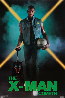
Is this a reference to The Iceman Cometh or X-Men? I’m not sure they even knew (or decided). With Xavier McDaniel’s signature crossed eyes, that evil glowing dog appears to be more of a seeing-eye dog than a hellhound waiting to be unleashed. They should’ve committed to the X-Men theme and given him the Cyclops goggles. It would’ve tied the whole thing together. Go Sonics.
2 | Vinnie Johnson: The Microwave
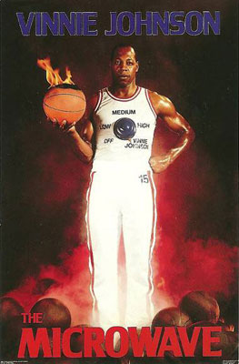
This is really your prototypical Costacos Brothers poster. Plain white uniform that replaces any identifiable logos or colors with stilted gimmick integration? Check. Athlete with a visible look of “Now how the hell did my agent talk me into this?” Check. Ball on fire? Check. I hope the Costacos Brothers took this one to all their trade shows.
3 | TR Dunn, Dan Issel, Alex English: Supermen III
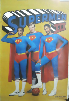
This poster featuring three uncomfortable Denver Nuggets (and possibly one major international copyright violation) was made in 1982. Well… two uncomfortable Denver Nuggets and Alex English (on the far right) channeling the seductive creepiness of a black John Waters.
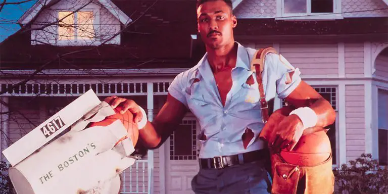
4 | Karl Malone: Special Delivery
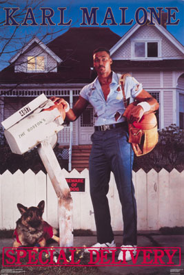
I’d be pretty upset if a male stripper destroyed my mailbox like this. I’m sure the Bostons were none too pleased, regardless of how quickly Karl ripped off those high-waisted giant pants.
5 | Joe Smith: The Joe Zone
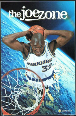
I can’t believe they put Joe Smith on a poster. Although that ozone busting theme ended up playing out truer to life than anyone realized at the time. Having to call the moving trucks to move you to 15 (yes, 15) teams in 16 seasons probably did end up giving him a hell of a carbon footprint.
6 | Dominique Wilkins: The Highlight Zone
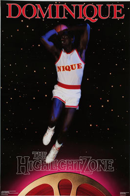
I chose this for one and only one reason — that jersey. Oh, that jersey. A true paragon of generic beauty. When they (apparently) couldn’t get the license to use the actual Atlanta Hawks jersey, this was the result. It reminds me of the kids’ Halloween costumes where you dress up as Spider-Man but your store-bought Spider-Man costume has a picture of Spider-Man on the chest and says “Spider-Man.”
7 | Dee Brown: Boston Dee Party
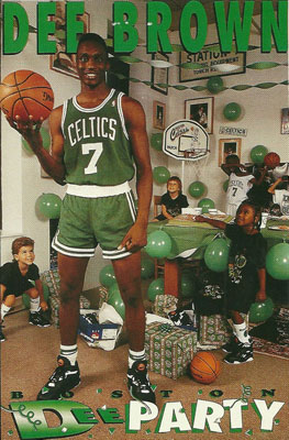
With the crumbling state of the NBA Slam Dunk Contest today, it’s hard to remember there was once a time when winning the dunk contest was a career maker. Like today, winning the dunk contest was not correlated to whether you were a decent pro basketball player; unlike today, it was at least enough to get you (seemingly) Photoshopped into posters.
8 | Chris Webber: 2 Legit
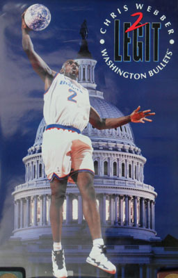
The first four or five years of the ’90s have a way of blending together in our collective nostalgia, so it’s important to clear something up. MC Hammer’s 2 Legit 2 Quit (and the beloved accompanying hand gestures) came out in 1991. Chris Webber’s first season with the Washington Bullets was 1994. So this poster was NOT a hip reference. It managed to come in at least three years late on a fad that had a one-month run. Even if things moved a little slower before the Internet age, they didn’t move that slow.
9 | Cliff Robinson: Cliffhanger
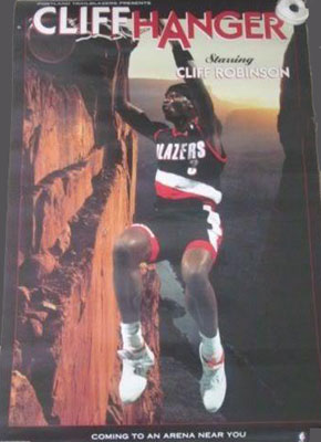
I actually kinda love this one. His name’s Cliff, he’s hanging on to the rim after he dunks, Cliffhanger was a big movie in the early ’90s — it’s really a perfect storm of factors converging into a finely crafted pun. Good for you, Cliff Robinson — you didn’t just work your way onto a poster as a relatively anonymous sixth man on a Pacific time zone team, you beat astronomical odds to get a poster with a really strong pun. Unlike, say…
10 | Chuck Person: Rifleman
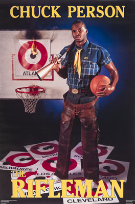
I looked at this one for a while to try to figure out what made it horrible. My eyes first went to the chaps. But that wasn’t quite it. I then looked at all the targets, noticing his aim was fairly mediocre, especially against Milwaukee. But that wasn’t it either. I almost blamed the Charles Nelson Reilly scarf. But just as that was about to get the heat, I realized what I hate most about this poster. It’s that the hoop is only two feet off the ground. Something about that throws off the entire sense of perspective.
On second though, nope. It’s the scarf.
11 | John Stockton: Point Break
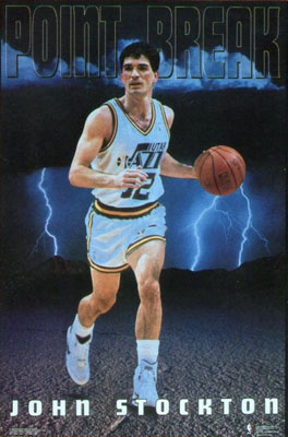
I know John Stockton was a point guard and I know he led a good fast break. But come on. You can’t associate John Stockton with the cinematic classic that IS Point Break. If the choices were jump or jerk off, he’d choose option C and get a jump… on doing his taxes.