Photos of a whole mix of bad product packaging, from obliviousness to irony to blatant lies.
I had tons of options to choose from in today’s tribute to stupid product packaging; that was a good thing, since I wanted to hit product packaging stupidity in as many different forms as I could. Below, we’ll run the gamut: Obliviousness, redundancy, irony, confusion, dishonesty, and, in one case, casual incest.
Companies have always and will always do stupid things with their product packaging as the threesome of marketing interests, overly cautious legal interests, and sweet, sweet bureaucracy is guaranteed to produce some truly deformed offspring. And the Internet is here to preserve those mistakes in perpetuity.
Here are 11 great moments in absolutely ridiculous product packaging…
1 | Whiteboard Cleaner: Great for Cleaning Whiteboards!
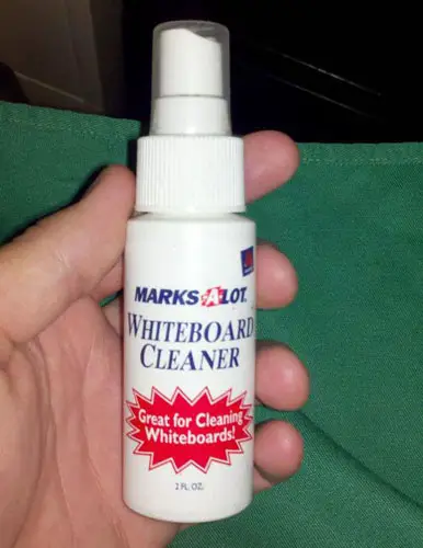
This seems like a gratuitous addition to the package; I think you inherently assume that when you buy whiteboard cleaner it is good at its one and only job. Although it would arguably be more impressive it were great at something else, like cleaning floors or dancing the tango.
2 | Underwear: Technically Sexy
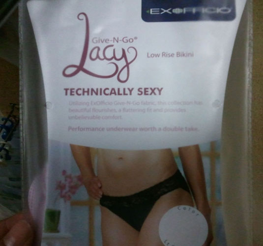
The word “technically” is just so perfect in this context — so many unintentional connotations. It seems they intended “technically” to describe the sophisticated construction of these underwear but it inadvertently makes the whole underwear buying process feel so cold and clinical.
3 | Scissors: Open with scissors
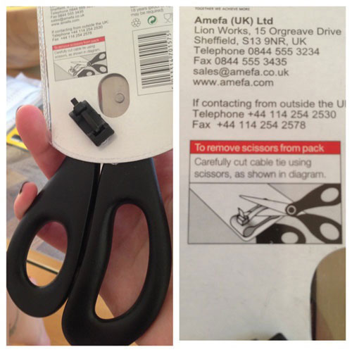
You’ve got to love a product that requires itself. Yes, most people have a spare pair of scissors around — but isn’t it presumptuous to assume they all do? (I will give them a slight pass, though, as during a recent move, I found I am the owner of at least a dozen pairs of scissors. I must’ve kept thinking I was out of scissors and buying more… they all surfaced during packing. I’m disappointed at my ballooning scissors budget, but it will be extremely advantageous next time I have to open a hard-to-open package of scissors.)
4 | Mangos: Perhaps a source of vitamin A
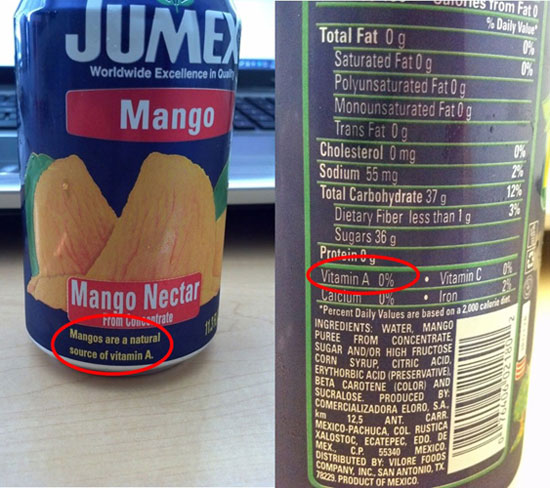
So, to review, mangos are a natural source of vitamin A… but this mango juice contains no vitamin A. Which means the good people at Jumex (?) had to go out of their way to strip down the mangos until they were completely void of their God-given nutrients. This package sums up why there’s a modern pushback against fruit juice as perfectly as anything ever could.
5 | Lays: New Bigger Size?
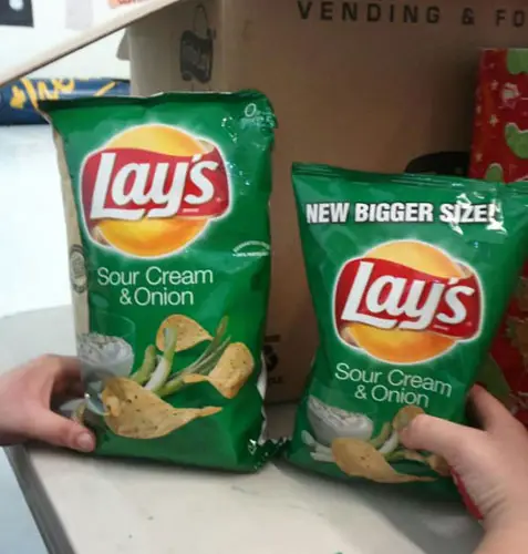
Bigger is a relative term, of course. I’m sure that bag of Lays on the right is bigger than *some* other bag of Lays — just not the one it’s sitting next to. It’s like that famous photo of Arnold Schwarzenegger standing between Andre the Giant and Wilt Chamberlain versus the movie poster for Arnold Schwarzenegger and Danny DeVito in Twins.
6 | Perfect Panty: Slightly Imperfect
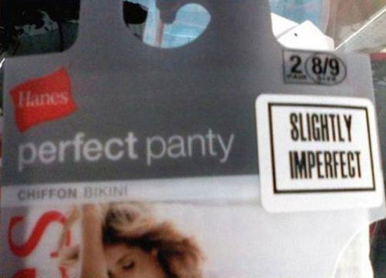
Rarely do you get to see such a spectacular contradiction played out so vividly. Also, rarely do I get to run two photos of women’s underwear on a single page of this website without coming across as a pervert. (I hope.)
7 | Canada Dry meets Captain America
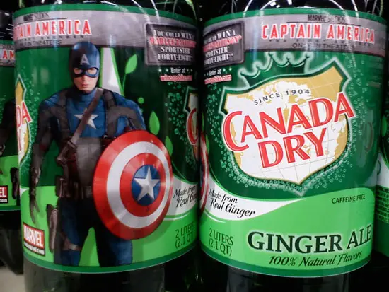
The people at Marvel couldn’t find any other soft drink for this promotion? This is literally the only soda sold in America that features the name of another country.
8 | Cousins?
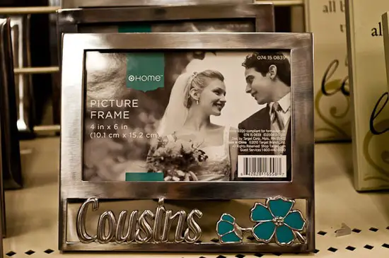
I’m not sure how Target matched up that generic sample photo with that frame. Perhaps they consulted my old list of 11 laws about marrying your cousins? Or, more likely, a list with similar content on a more credible website?
9 | Climbing rope: Not for climbing
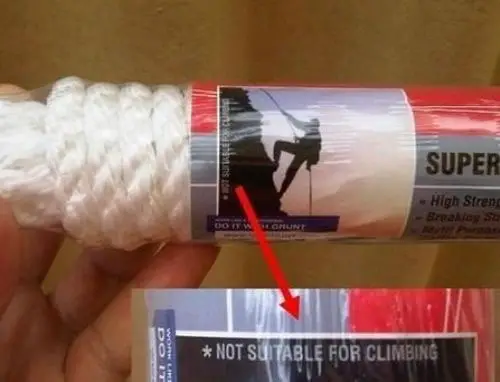
It’s a pretty bad idea to put a photo of a guy climbing with a rope on the package of your rope if it’s not for climbing. Not only is that dangerous for people who don’t read the fine print — it’s even MORE dangerous for people who do read the fine print and are then overwhelmed by a reverse psychology drive to climb with the rope.
10 | Not based on a fact
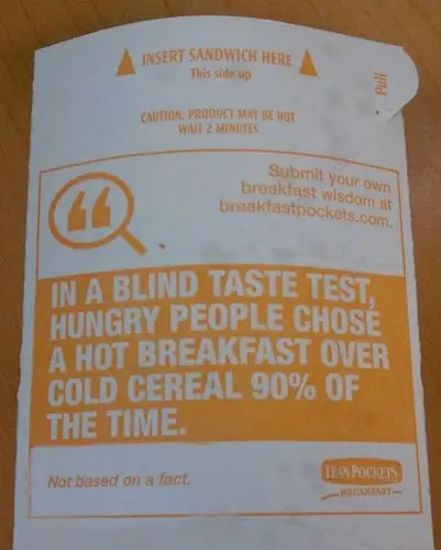
So this package features a fact in giant text — with a small disclaimer that it’s not actually a fact? Why did they bother with it? Whoever is doing the microwaving has already made the sequence of life choices that led them to eating a breakfast that needs to be microwaved in a cardboard sleeve. You don’t need to sell them, and you especially don’t need to sell them by admitting you’re lying to their face.
(One caveat: Although I’m inferring that the taste test statistic is “not based on a fact,” that disclaimer could technically apply to anything on the package since there’s no asterisk. Perhaps the product may NOT be hot. You should wait three minutes. It’s not a lean pocket. It’s not for breakfast. You should insert the sandwich elsewhere. Or, most damning, this side should be down.)
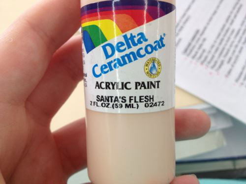
11 | Acrylic Paint: Santa’s Flesh
I get the need for paint colors to get oddly specific — I’ve actually been on one of those Home Depot trips where the choice between paint that’s canary or buttercup leads to a five-minute debate — but this is too oddly specific. How do they know what color Santa’s flesh is? And why is it so milky? And most important: Why does everything about this make me think the people at Delta Ceramcoat murdered Santa?