The ugliest college football fields, basketball courts and more.
So last night I was watching a popular sports wrap-up show and saw some clips from the women’s Final Four. And wow… that court ain’t got no alibi.
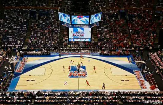
See, the Final Four is in St. Louis so they wanted to put the Gateway Arch on the court. Either that, or the court is frowning about being located in St. Louis. Either one.
[Edited to add: Apparently the Final Four isn’t in St. Louis this year, they were flashing back to 2009 and I didn’t realize it. Regardless, the ugliness of the court and all the mild St. Louis zingers still stand.]
Then, I was web procrastinating and I saw that Central Arkansas unveiled what they’re planning to do to their football field.
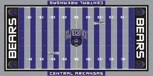
In their defense, their most prominent alum is Scottie Pippen, so they’re used to getting publicity via ugliness.
I decided not to call these two sightings a coincidence, and immediately started putting together this list. Here are 11 of the most hideously ugly football fields and basketball courts from the past few decades.
You might only want to view these through a pinhole in a shoebox.
1 | Oregon Ducks basketball
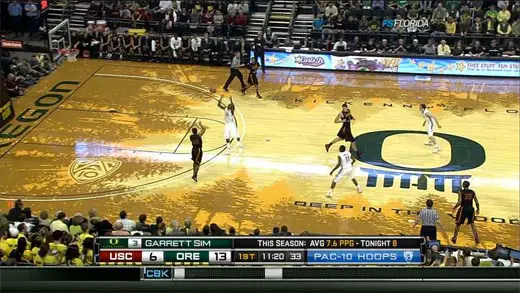
I mean… by the Law of Large Numbers, *something* Oregon does should be aesthetically pleasing at some point. But, thus far, 9,000 football jerseys and one avant-garde, tree-silhouetted basketball court in, they haven’t managed to hit.
2 | Houston Rockets mid-’90s basketball
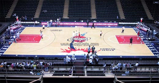
I set myself a limit of only three mid-’90s NBA courts for this list. Boundaries are boundaries. The Rockets were my top pick. It was actually quite difficult to find a photo of this court online. It’s almost as if they’re actively working to try to eradicate it from our memories.
3 | Boise State Broncos football
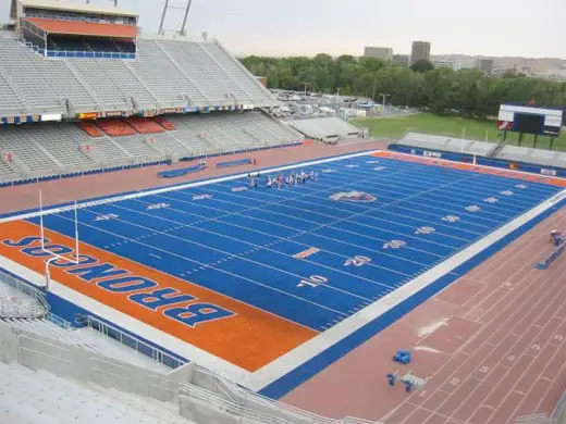
Ah yes, Boise State… home of the blue turf that is about to be the patriarch of a horrible, horrible trend. See, Boise State colored their field blue 25 years ago, and no one really cared. Because they were fairly anonymous as Boise State. Then, a few years ago, they got really, really good at football… they became nationally relevant… and the blue turf became associated with winning.
First Eastern Washington bit off them with red turf (we’ll discuss that below). Now Central Arkansas is joining the party (as discussed in this list’s preamble). And it’s not going to stop there. We’re in Rebecca Black’s America, where it’s been definitively proven that getting an avalanche of negative attention is better than no attention at all. So expect more and more and more schools to opt for hideous field colors in a depressing attempt to get noticed. And when they do, we can all blame Boise State and their unexpected reign of terror atop their horrible, horrible field.
4 | Men’s Final Four 2001, HHH Metrodome in Minnepolis
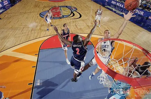
As a rule of thumb, anytime giant cartoony basketballs are a part of a court design, it’s going to be bad. It wasn’t the ’90s anymore; by 2001 you’d think they would know better. (That being said, it’s still more attractive than the college basketball product from the past decade. What’s that you say, Mrs. Robinson? Christian Laettner’s left and gone away?)
5 | Cincinnati Bengals football
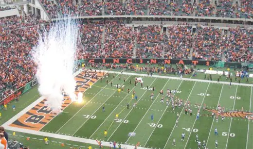
Usually, my life philosophy is: There’s no such thing as too much Zubaz. But even I (and arguably even the neckless men of Gold’s Gym) think the Bengals take it too far.
6 | Texas A&M Aggies basketball
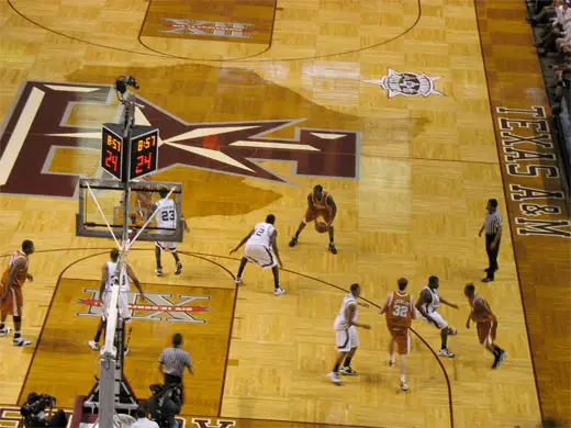
It’s almost like they consulted with the Family Guy manatees to design their court. Parquet? Check. Two-tone wood? Check. Unnecessarily gigantic outline of the state of Texas? Check. Even more gigantic school logo? Check. Emmanuel Lewis in a chicken costume singing the theme song to Charles in Charge to Gweynth Paltrow at Dairy Queen? Check.
7 | Estadio do Morumbi, Sao Paulo, Brazil
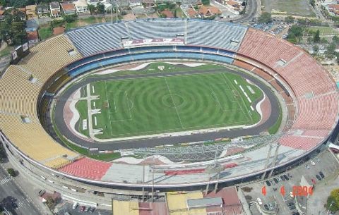
Token “other kind of football” entrant. I do like that it appears everything in this stadium was designed to hypnotize. For what it’s worth, though, those concentric circles must make a hell of a target if the Fan Man decides to fly onto the pitch.
8 | Cleveland Cavs mid-’90s basketball
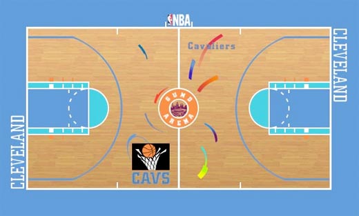
The problem starts with the unnecessary teal (in the ’90s, sports teams did everything they could to push teal) and ends with the rainbow-colored firework sperm. This court is the ugliest thing ever to happen to Cavs basketball (other than whatever it looked like when Delonte West was cougar hunting).
9 | Eastern Washington Eagles football
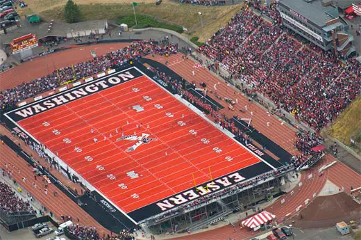
Please note this is the third entrant from the Pacific Northwest. I promise, guys, you don’t have to try so hard. One day the rest of the country will start paying attention to you. One day.
10 | Charlotte Hornets mid-’90s basketball
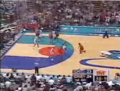
The two-tone bright colors around the key, the forced graphic basketballs, the teal hornet with an asymmetrical trail… every part of this is so incredibly contrived it’s like watching a Sex and the City movie. This court is such a Charlotte.
11 | Louisiana State Tigers football
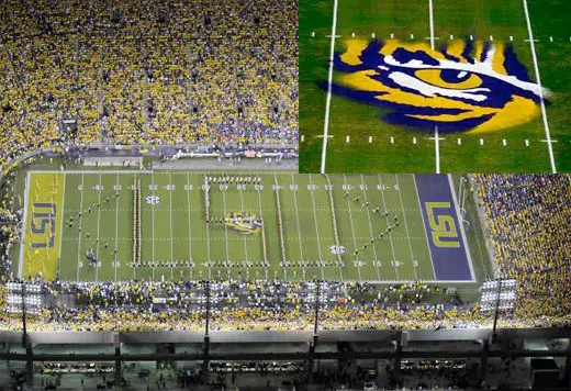
I’ve always found the LSU field comical for two reasons. One, the numbers every five yards instead of every 10 — a whole heapin’ mess of clutter that’s only good if you have trouble countin’. And two, the not-even-close-to-as-intimidating-as-they-want airbrushed tiger eye. That eye of the tiger doesn’t make me think they’re rising up to the challenge of their rivals OR being the last-known survivor stalking their prey in the night.
(I anticipate the angry response to this. Who’s going to be the first person to call me an assheauxle? Who?)