Sometimes a sign delivers a full dose of self-deprecating honesty.
If I were tweeting about these signs, I’d end each tweet with “Sad!” (But, of course, that would mean tweeting instead of just sharing my pithy comments with my dogs.)
Here are 11 pictures of signs that comically toe the line between overtly sad and refreshingly honest.
1 | Not a Hilton but… It’ll Do
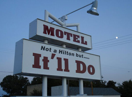
This is really the name of a motel in Atwood, Kansas. I’m not sure a Hilton is necessarily the pinnacle of aspiration, but you can’t fault the self-awareness.
2 | Cape Disappointment State Park
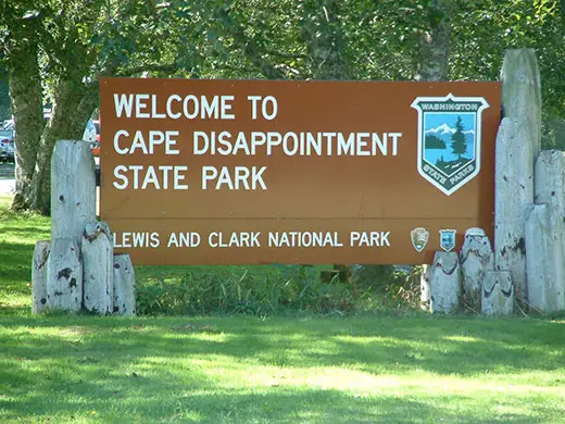
Cape Disappointment got its name when a late 18th century fur trader just missed it (and, in the process, discovering the Columbia River) because he turned his ship around in a storm. The “Disappointment” doesn’t, at the core, refer to any characteristic of the cape itself. That being said, apparently there’s a good chance of disappointment when visiting for its spectacular views; it has 106 days of fog a year. That qualifies it as one of the foggiest places in the U.S. (and would make it approximately the 18,000th foggiest in the U.K.)
3 | Owner diagnosed lactose intolerant
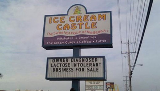
If Alanis ever updates Ironic, this is a perfect example of her proprietary definition of irony.
4 | Grandpa Finally Died Sale
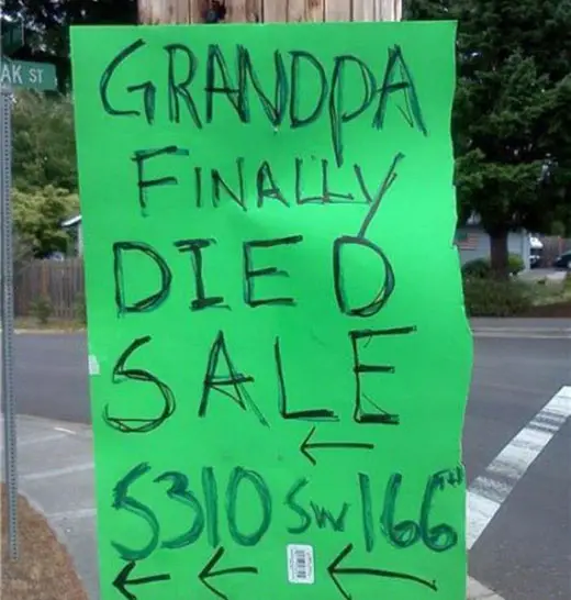
So they’re this happy that grandpa died — so happy they didn’t even bother to take the barcode tag off the poster board in their rush to get it up? I have a feeling this garage sale is full of jarringly offensive 1920s porcelain dolls of black people and lots of German World War Two memorabilia that wasn’t necessarily being collected for objective historical merit.
5 | Boring Oregon City
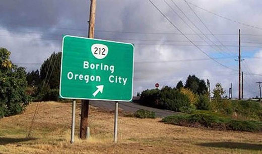
Boring, Oregon is Internet famous for its name (and its sister city relationship with Dull, Scotland and Bland, Australia). On its own, it’s a great city name. But when teamed up on a punctuation-free sign with Oregon City, Oregon, thus forming the phrase “Boring Oregon City” — well that gives it that extra pinch of je ne sais quoi to elevate it even higher.
6 | Wedding dress $50 worn once by mistake
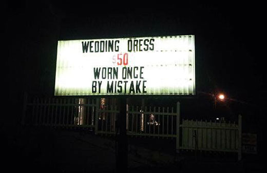
Is this the sequel to Hemingway’s favorite six-word story?
7 | Nicer sign coming soon!
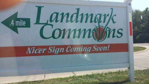
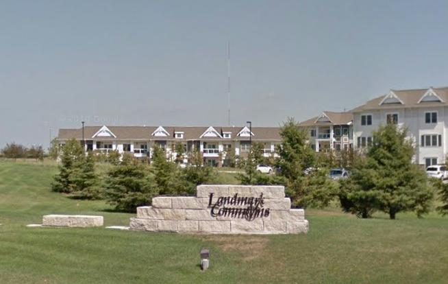
I don’t know when this photo was taken. But I’d be willing to bet that no, a nicer sign never came. It’s like when websites used to put up “Under Construction” gifs. And not the cool, modern gifs — the janky ’90s gifs. That construction never, ever happened.
[Edit 12/9/16: I was wrong! A reader named Dennis sent in a photo of the new sign.]
8 | Welcome to Nada, Community of “Hope.”
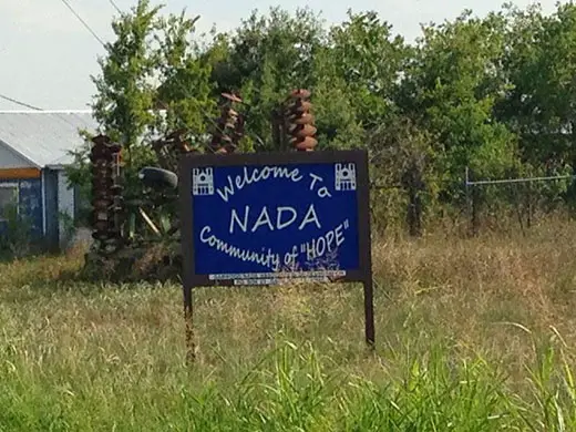
Putting hope in quotes is fantastic (I do love misused quotation marks). When paired with a town called Nada? That’s just ideal.
9 | A $400 sign to get you to buy a $6 beer
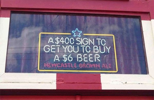
Ah yes, the self-deprecating wit you need to get attention for a British beer owned by a Dutch conglomerate sold primarily in the United States.
10 | 54 beautiful ladies
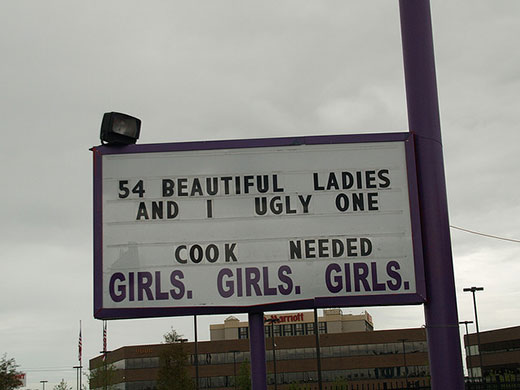
The “n beautiful ladies and 1 ugly one” sign is surprisingly common for strip clubs (I’ve observed via looking at photos of funny signs on the Internet, not through empirical research). I’d describe the tactic as “cheeky,” which is on brand. I picked this particular sign because I loved that the person making the sign used the letter “I” instead of the number “1.” Could it be that an insecure stripper was in charge of putting up the sign and made it subconsciously autobiographical? Or maybe the cook did it, got fired for a lack of attention to detail and is now being replaced? I’m sure it’s one of those two.
11 | Decent Pizza
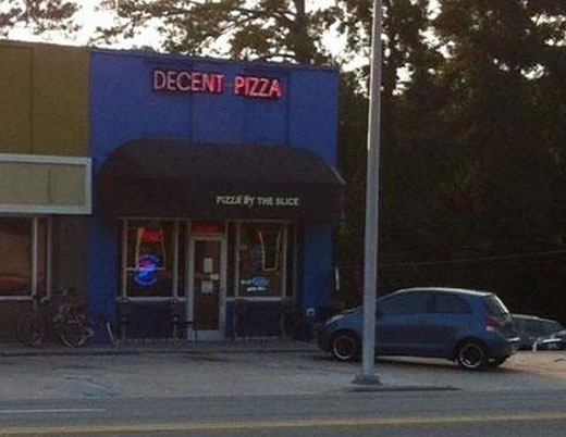
I see Doughy’s changed its name.