The New Jersey Nets went tie-dye, the Toronto Raptors had an angry Barney and more.
Did anyone realize the NBA season starts tonight?
If the rain pushes the World Series any more, in theory, on Sunday, there could be pro baseball, football and basketball all happening simultaneously.
Anyway, it’s not really my style on here to do something like an NBA preview, so I’m going to go in a different direction: The 11 ugliest NBA uniforms of the 1990s… arguably the biggest fashion disaster decade (at least sports-wise) of the 20th century.
1 | New Jersey Nets Tie-Dye (1990-91)
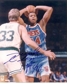
Stuck in the ’80s with all the hideousness of the ’90s, for one glorious season, the New Jersey Nets had road uniforms that were kinda stonewashed, kinda tie-dyed and fully incredible.
2 | Cleveland Cavs Powder Blue Paint Stroke (1994-97)
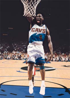
According to the website where I got the picture below, it’s actually Photoshopped; they took Shawn Kemp out of his Sonics jersey (and off the Sonics court) and transformed them into the Cavs’ jersey and court. I probably should’ve known this without them saying it, because Shawn Kemp was lugging about 200 pounds more body fat when he actually put on the Cavs uniform for the first time. Oh, and he couldn’t dunk anymore. And the future baby mamas of Cleveland had no idea the storm that was about to hit town.
3 | Houston Rockets Pinstripe Stew (1995-2002)
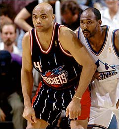
I call these the pinstripe stew uniforms because, it seems, the Rockets braintrust took every single “cool” design idea they could think of and tossed them all into one uniform. Huge pinstripes? Check. Large ostentatious logo? Check. Teal? Check. Asymmetry? Check. 40 different colors? Check.
4 | Toronto Raptors Angry Barney (1995-99)
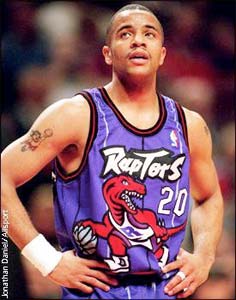
Yes, the dinosaur is red. But the uniforms were purple. And there is only one possible mental bridge you can draw when you think of “purple” and “dinosaur”. Regardless of how mean the Raptors made their dinosaur look.
5 | Atlanta Hawks In the Clutch (1995-99)
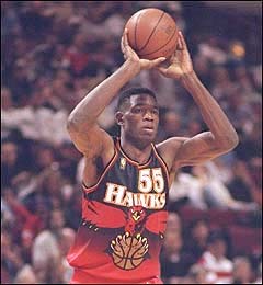
Over-the-top and ugly. With a gradient thrown in for extra ’90s flair. I decided to refer to it as the Atlanta Hawks In the Clutch jersey, in an effort to be the first person to refer to the Hawks as clutch in history.
6 | Indiana Pacers Go Yellow (1999-present)
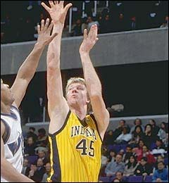
The Pacers had fantastic uniforms for most of the ’90s. Then they went pinstripes, and they went yellow, and became hideous. This is arguably the darkest moment in franchise history… way worse than anything that may’ve happened at the Palace at Auburn Hills.
7 | 1995 Phoenix All Star Game (1995)
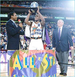
The uniforms have a hideous color scheme and desert motif design. Plus, these uniforms led to Mitch Richmond winning the All Star Game MVP. I mean… come on.
8 | Vancouver Grizzlies Claw Attack (1996-2000)
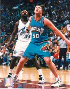
The effort to make Grizzlies look 3-D is quite sad. The pattern around the sleeves is sadder. But you know what’s saddest? That Bryant “Big Country” Reeves never became an NBA superstar.
9 | Philadelphia 76ers Patriotic Swoops (1991-94)
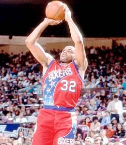
A big blue swoosh complete with clip-art quality stars, a generic font and, yes, more of that popular ’90s asymmetry. We were all so asymmetrical back then. Those were the days.
10 | Utah Jazz Mountain Range (1996-2004)
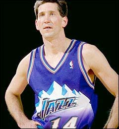
I just don’t get how any designers thought it would be cool to awkwardly make a mountain range go across the entire front of the uniform.
11 | Detroit Pistons Going Teal (1996-2001)
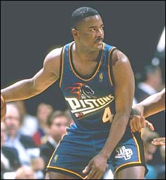
During the ’90s, everyone was going teal, and even a franchise with history, like the Pistons, couldn’t avoid the wave. They should probably be more embarrassed than any other franchise for falling victim.