K-Pax, Mel Gibson, two Jennifer Lopez movies, From Justin to Kelly, Crash and more.
I’ve previously done lists on the worst movie posters of the ’80s and worst movie posters of the ’90s; it was only fair that the 2000s get a look as well.
The 2000s weren’t quite as fertile ground as the previous two decades. We don’t have the distance, obviously, from 2000 to 2009 that we do from the ’80s and ’90s — more distance equals more comedic punch. Also, the ubiquitous and ongoing Hollywood trend to play everything as safe as possible trickled down to the movie posters as well. No one’s taking huge chances with a poster (or movie itself) that might be great or might be embarrassingly bad anymore — the by-the-numbers middle is fine.
But still, you make enough stupid movies, eventually you’re gonna make some stupid posters. I did wind up having about 30 good candidates to choose from and selected these 11 as the worst movie posters of the ’00s. Enjoy the too-soon-for-nostalgia nostalgic trip down short-term memory lane…
1 | The Wedding Planner (2001)
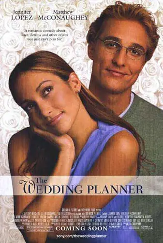
I laughed out loud at normcore Matthew McConaughey and Jennifer Lopez. There’s an artist named Planet Hiltron who does some great Photoshopping of what celebrities would look like if they were “average” Americans (check out his work here). This poster inadvertently, and somewhat impressively, did that to its two leads without the aid of Photoshop.
2 | Good Luck Chuck (2007)
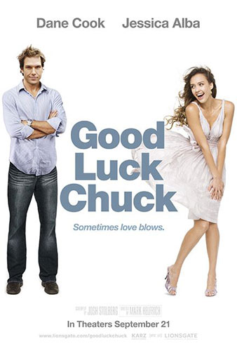
Good Luck Chuck was one of those films from the brief and odd “Dane Cook as a leading man” era. The movie is about a guy who has sex with women and then, afterwards, they magically meet their husbands. So, because every woman is just desperate to get married and nothing else, the movie is mostly Dane Cook in sex scenes — like, dozens of sex scenes. Almost a disturbing amount of sex scenes. When he meets Jessica Alba, he can’t have sex with her, lest she go on and find a husband who’s not him. Basically, it’s a grunting R-rated sex “comedy” from start to finish with a few requisite romcom beats speed bumping it along the way.
This poster makes it seem like a straight romantic comedy, possibly about a guy who has the power to control the wind?
3 | Corky Romano (2001)
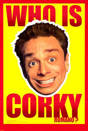
If you remember how the Internet looked back in 2001, every site had really ostentatious, loud ad banners that employed the strategy of “if we’re enough of an eyesore, people will click on us.” This movie poster used that strategy — loud colors to get attention — and also banked on the appeal of “Chris Kattan makes a wacky face.” I’m not sure I’ve ever met anyone who watched Corky Romano.
4 | Gigli (2003)

Ah, the disaster that was Gigli. It’s really kind of amazing how the look on Ben Affleck’s face is ostensibly supposed to be, “I am passionately attracted to you,” but comes off as, “Hmm. OK. Yeah. Alright. Fine.”
5 | What Women Want (2000)
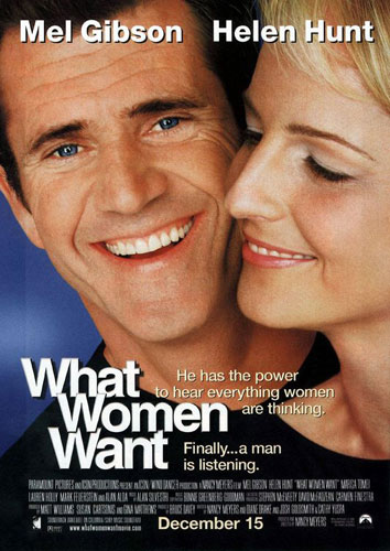
Back then, what women wanted really was Mel Gibson. What a difference 14 years, a rage problem and some militant anti-Semitism make. Apparently women also wanted the Arial font with a significant drop shadow back in 2000, they don’t want that anymore either.
6 | Norbit (2007)
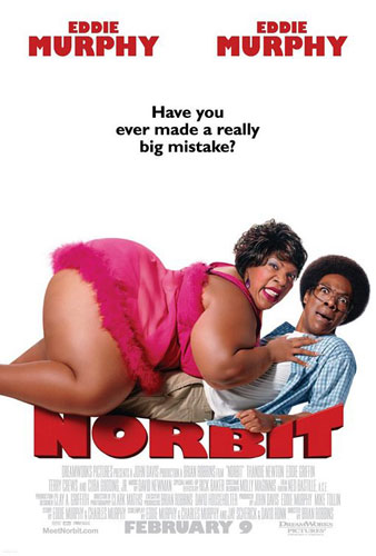
Academy Award nominee Norbit was nothing but wrong from top to bottom, and the poster is part of that whirlwind of horror. Seeing an obese female Eddie Murphy crushing a skinny nerdy Eddie Murphy made approximately zero people interested in paying money to see this movie.
7 | Let’s Go to Prison (2006)
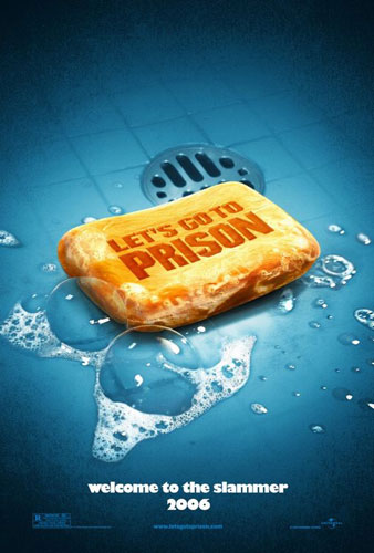
“Don’t drop the soap in prison” jokes are among the laziest and hackiest jokes in the world, right up there with jokes about airline food, cops loving donuts, bad British teeth and the disaster of Gigli. So naturally this poster decided to eschew everything BUT a dropping the soap reference — even the tag line plays into it.
8 | K-PAX (2001)
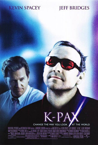
Kevin Spacey may or may not be trying to give off a generic, creepy, Bono-on-Oxy look. My highlight is that Jeff Bridges is NOT trying to give off a creepy look but comes off exponentially creepier.
9 | From Justin to Kelly (2003)
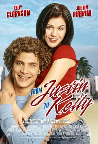
There was more sexual tension between Simon Cowell and Ryan Seacrest on a nightly basis on American Idol than between Justin Guarini and Kelly Clarkson on this movie poster. In fact, it was so aggressively asexual that, at some point in the process, the producers had the poster redone and Photoshopped to make Kelly Clarkson’s butt more voluptuous.
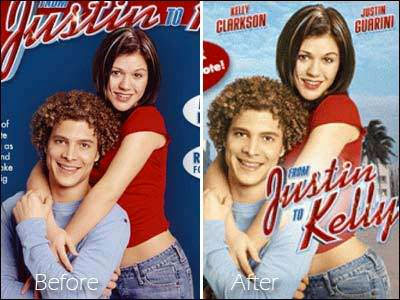
That would spark more than a decade of people nitpicking Kelly Clarkson’s body. Leave Kelly alone, guys.
10 | Crash (2004)
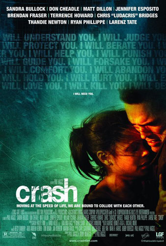
So yeah, we really gave the Oscar for Best Picture to a movie where the poster used the tagline, “Moving at the speed of life, we are bound to collide with each other.” Moving at the speed of life. I’m still baffled.
11 | Milk (2008)
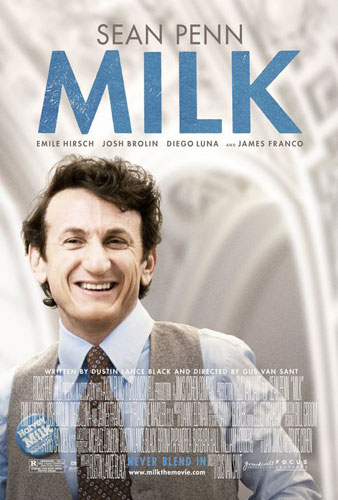
Based on the overall color scheme and design motif, is it possible the company that made this poster got confused and thought it was an advertisement for actual milk?