Minor league baseball teams are getting weirder with their logos. Here are some of the best ones out there today.
After the World Series, I decided to stay off the Internet for a while. And just as I was ready to get back in, the election happened, and I quickly re-upped my embargo. Anyway, I think it’s been long enough. And what drew me back in?
A minor league baseball team turning its logo from a zephyr into a mean, giant baby.
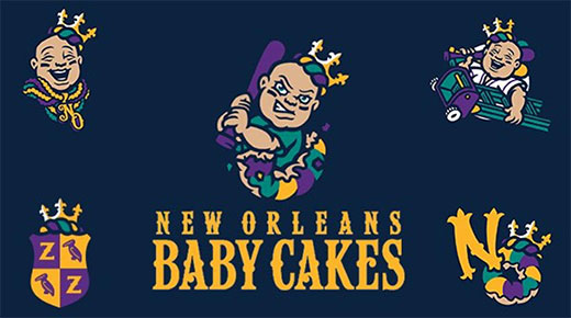
Those are the new logos for New Orleans’ minor league team, joining a growing — and frankly wonderful — movement of minor league teams getting weird with their branding. Minor league baseball has been embracing gimmicks at its ballparks for several years now (it’s easier to draw people to a single-A baseball game when there are four-foot donuts and performances between innings by 2/5ths of Chumbawumba).
Now they’re figuring out that if they rebrand to more off-the-beaten-path mascots and logos, they can move merchandise — even to people who’ve never been to a game (or the city).
Below are the hats for 11 Minor League Baseball teams who are doing funny, weird or otherwise comically commerce-worthy with their logos.
1 | Biloxi Shuckers (AA – Milwaukee Brewers)
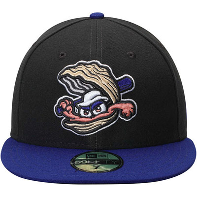
It’s not easy to make an oyster menacing — especially an oyster in a Gilligan hat — but they did a pretty good job pulling it off.
2 | Eugene Emeralds (A – Chicago Cubs)
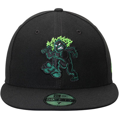
The logo celebrates the Pacific Northwest’s biggest celebrity, the Sasquatch (no offense, Eddie Vedder). But it appears this Sasquatch was fathered by the Jolly Green Giant, which is worth suspension of disbelief.
3 | Fresno Tacos (AAA – Houston Astros)
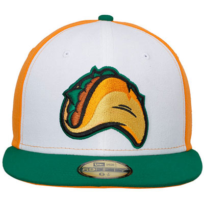
The Fresno minor league team is actually the Grizzlies, but they did a temporary rebranding to celebrate Fresno’s proud history in tacos and the taco-related arts. And it produced this hat, which is really the pinnacle of sports merchandise.
4 | Frisco RoughRiders (AA – Texas Rangers)
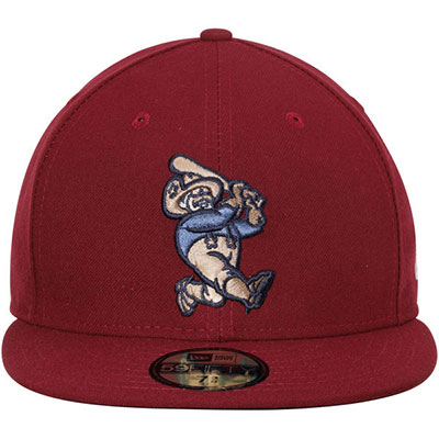
RoughRiding isn’t just for CFL teams anymore, baby. This team in Frisco, Texas uses a sluggin’, Rubenesque Teddy Roosevelt as its logo.
5 | Hillsboro Hops (A – Arizona Diamondbacks)
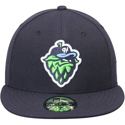
Much like the angry oyster above, it’s hard to make a sinister hop (is that the singular?) — maybe even harder — but they pulled it off. My only disappointment is that the hop is wearing a hat with an “h” on it, not this hat, which would’ve created an endless embroidery loop.
6 | Jacksonville Jumbo Shrimp (AA – Miami Marlins)
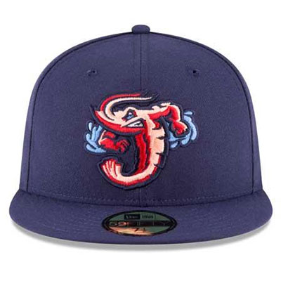
The Jacksonville Suns just rebranded as the Jumbo Shrimp. I like the muscular shrimp organically forming the letter J — that’s quality design.
7 | Lehigh Valley Cheesesteaks (AAA – Philadelphia Phillies)

Much like the Fresno Tacos (nee Grizzlies), the Lehigh Valley IronPigs did a temporary rebranding as the Cheesesteaks to honor local cuisine. Can’t say I support going whiz wit-out, but don’t let that take away the enjoyment of a giant cheesesteak on a hat.
8 | Omaha Storm Chasers (AAA – Kansas City Royals)
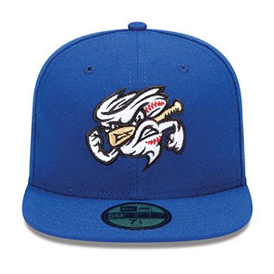
It’s a tornado made out of a baseball impaled by a bat. That is so intense.
9 | Reading Fightin’ Phils (AA – Philadelphia Phillies)
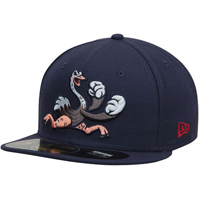
That’s an ostrich putting up his dukes like an old timey boxer. And it seems like a good call by him, since he clearly has gigantism of the dukes.
10 | Trenton Thunder (AA – New York Yankees)
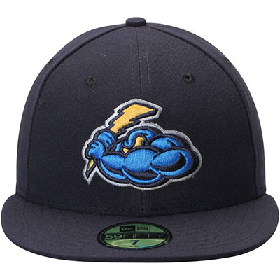
Bravo to the team at Trenton for finding a way to make a powder blue cloud legitimately intimidating.
11 | Montgomery Biscuits (AA – Tampa Bay Rays)
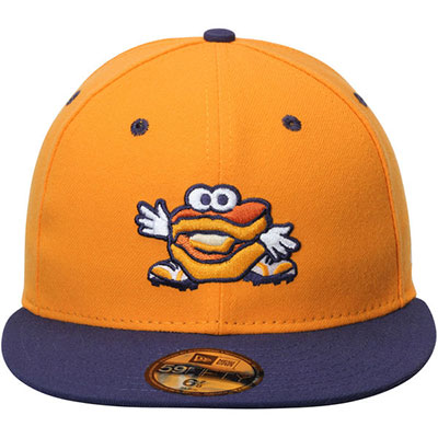
Unlike other teams with goofy mascots who tried to go mean or snarling, the good people at Montgomery seemed to just throw up their hands and decide the biscuit’s only option was a big, friendly smile.