So, so many American cities have flags that look like they were made in MS Paint.
Why are cities so incredibly bad at flag design?
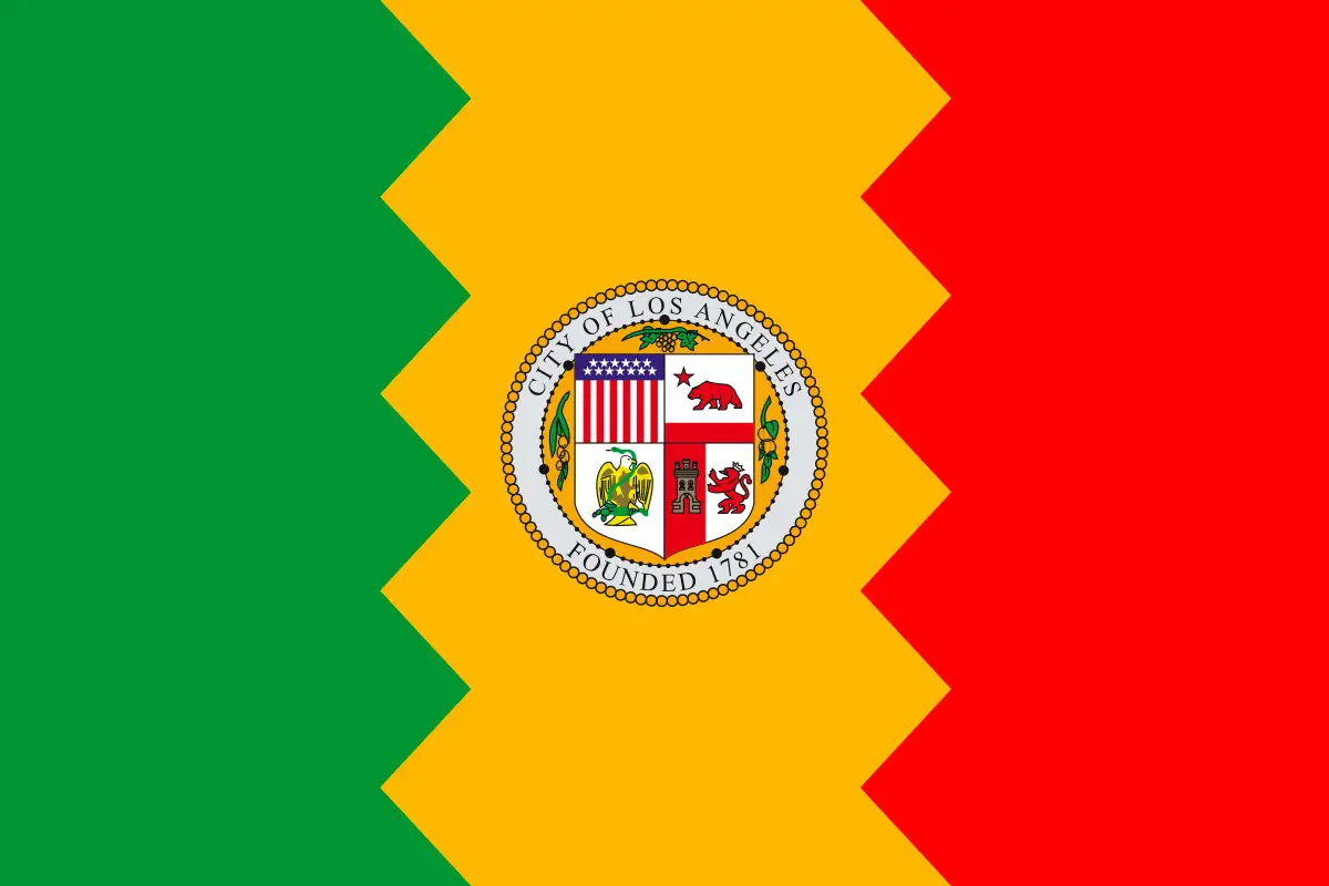
They’re bad to such an extent that city flags are not really a known quantity. Like, I’m rapidly closing in on two decades in Los Angeles and the first time I ever remember seeing the flag was when I researched this list. And I would’ve remembered the flag, because I certainly would’ve said to myself, “What the hell is going on with that flag, is it a joke?”
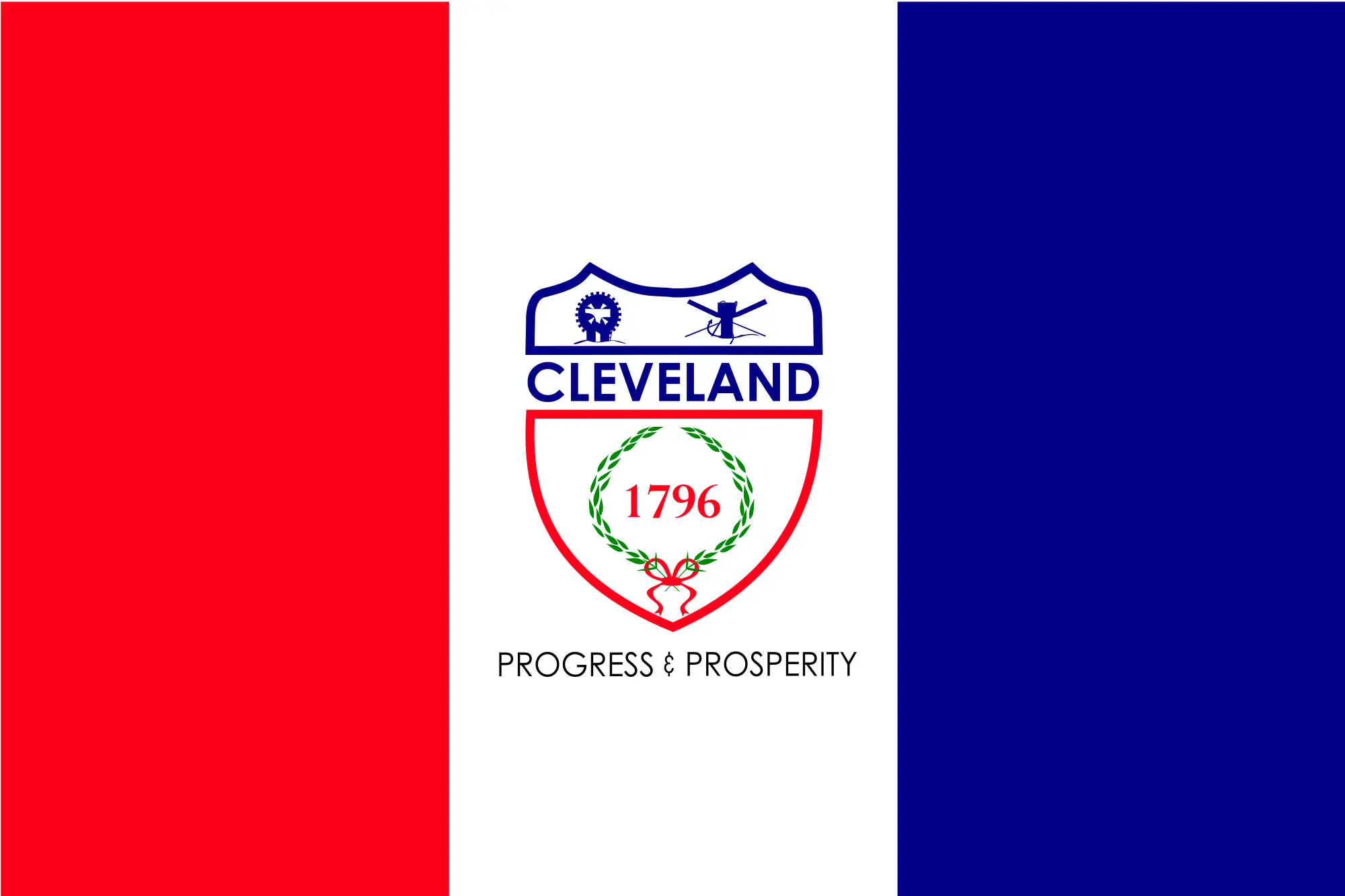
I also lived in Cleveland damn near two decades and have no memory of ever seeing its flag either. And Cleveland’s design isn’t actually all that bad. I’ve always felt that, in so many ways, Cleveland is a mirror image of France.
Not all city flags are bad. Chicago’s is great and iconic (and perhaps the one and only one I could’ve described from memory). There are a few others as well that really get it right. Maybe I’ll cover those in a follow-up list. But generally — no. City flags by and large feel like they were designed by each respective city’s mayor’s kid on MS Paint. And not a recent version; the Windows 3.11 For Workgroups version.
So picking the 11 most comically ugly city flags was a hell of an endeavor. Fortunately, I had a jumping off point. In 2004, the North American Vexillological Association — I’m sure those guys know how to party — ranked the flags from 150 major U.S. cities from best to worst. And the drop off from “good” to “bad” is pretty significant. The list is basically a handful of pretty cool flags, followed by a bunch of inoffensive ones where it’s just a city’s seal slapped on a plain color background, followed by nightmare after nightmare after nightmare.
And clearly, the NAVA’s judgmental list really affected the bottom cities. The bottom three (Pocatello, Idaho; Huntington, W. Va.; Rapid City, S.D.) all quickly redesigned their flags. Milwaukee, which finished fourth from the bottom, commissioned a redesign but hasn’t officially adopted it yet. And other near-bottom finishers (including Mesa, Ariz.; Lubbock, Texas; Provo, Utah; and Montpelier, Vt.) also banged out redesigns.
Which means there’s a need for new blood on the worst city flags list. Here are the 11 I picked…
11 | North Pole, Alaska
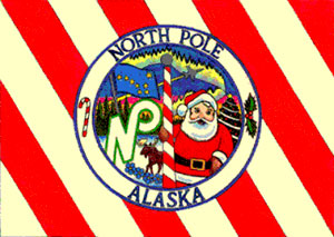
I get that a town called North Pole in Alaska lives and dies by its gimmick. But there’s got to be a more dignified way to have that gimmick manifest itself in flag form. Especially since the city’s not, like, selling mass quantities of this flag at its souvenir shops. There’s a reason that graphic above is so small — images of North Pole’s flag aren’t all over the place. That was the largest version of it I could find online.
10 | Jacksonville, Florida
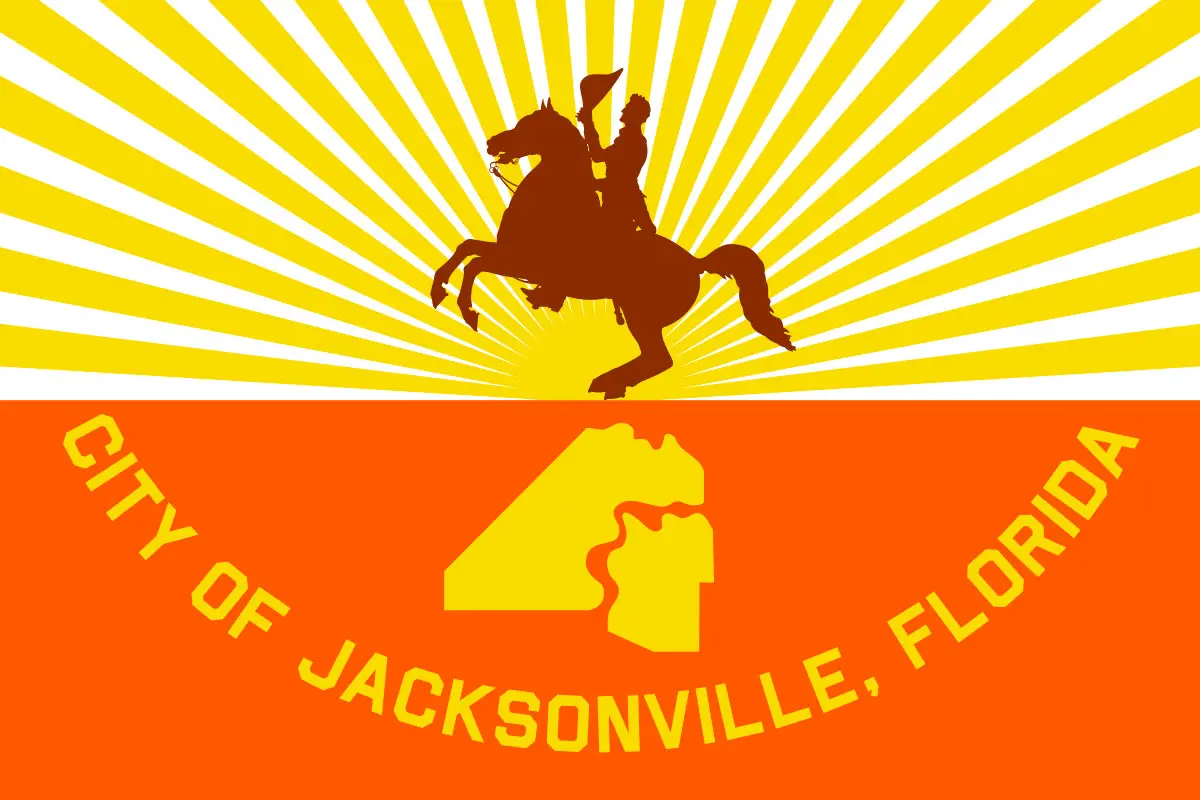
I now know, thanks to a little research borne out of utter confusion, that northern Florida has a proud cowboy history. (Side note: Is there anyplace with cowboy history that wouldn’t call it a “proud” cowboy history? It might be the most pride-inducing history genre of all.)
That being said, this flag looks like it should belong to a city about 2,000 miles west and it somehow got real, real lost.
9 | Rochester, Minnesota
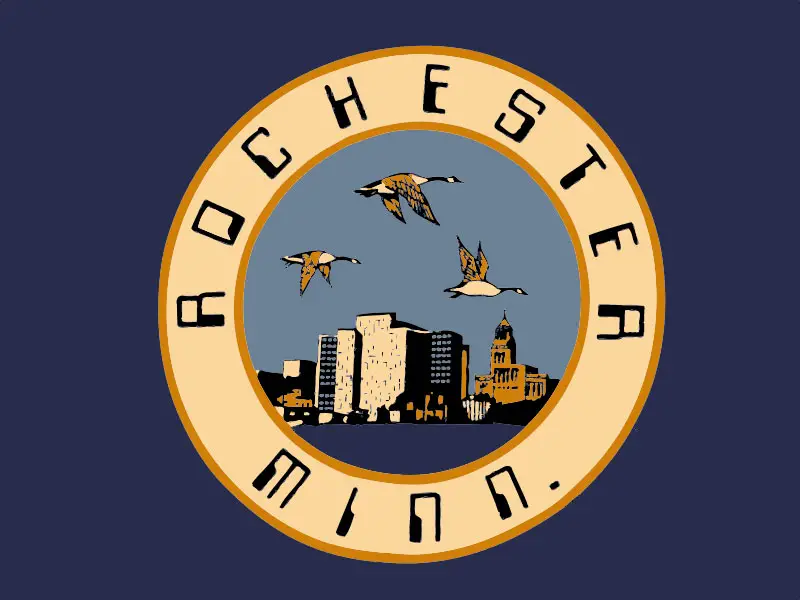
Apparently they were going for the whole “Apple IIgs” look, which I love in a retrofuturistic way — just not on a flag. Font choices matter.
8 | Plano, Texas

I’m not positive, but I think they ripped off their city logo from one of those companies that supplies food to convention centers.
7 | Anaheim, California
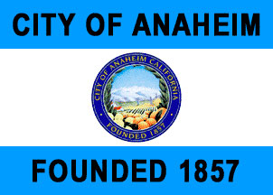
They couldn’t just slap some mouse ears on top of an orange and call it a day? The garishly gigantic “CITY OF ANAHEIM” and “FOUNDED 1857” take this flag to the next level of hideousness.
6 | Glendale, Arizona
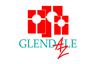
Like so much in Arizona, it appears this flag was designed with totally ’90s sensibilities and never touched since.
5 | Jefferson City, Missouri
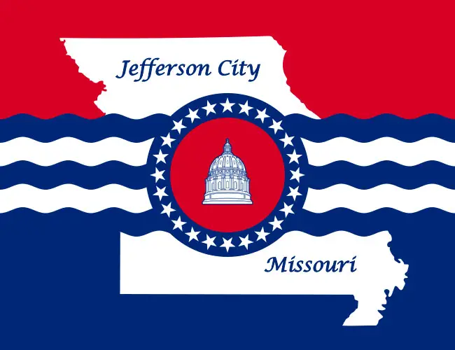
None of the elements here work together well: From the ostentatious waves bisecting the state… to the line art of the capitol building that appears indistinguishable from other capitol building in the country… to the “American flag in a funhouse mirror” overall aesthetic. But as a font guy, I think I’m most bothered by the usage of that low budget Zapf Chancery ripoff joint they picked.
4 | Inglewood, California
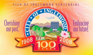
Someone was really up to no good designing this flag in 2008. Did they make it as a splash screen for the city website and then decide to transition over to their flag?
3 | Milwaukee, Wisconsin
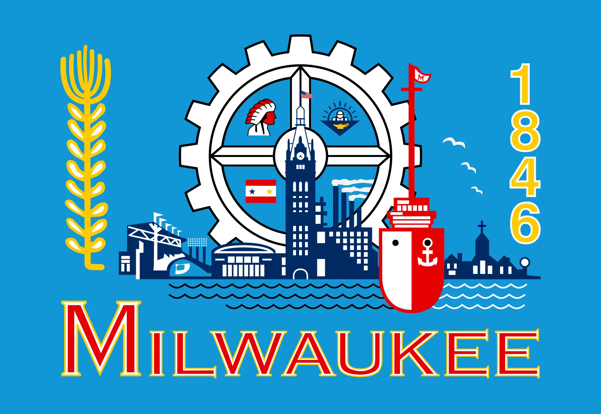
There’s a reason the people of Milwaukee are desperate to change this much-maligned flag design. It’s like the city bought a clip art collection CD-ROM and decided to dump its entire contents onto their flag. Including, among other things, some other flag and a crimson red Native American.
2 | Detroit, Michigan
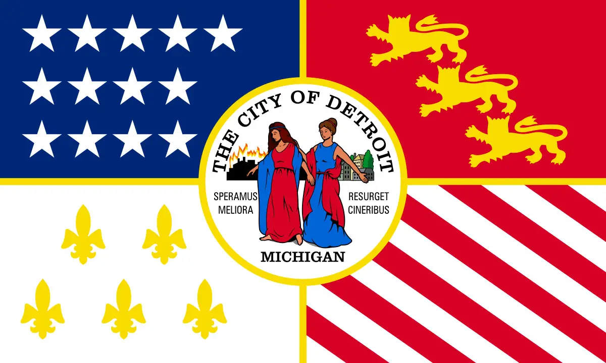
And yet, somehow, Detroit’s flag feels like even more of a chaotic orgy of clip art than Milwaukee’s.
1 | Tampa, Florida
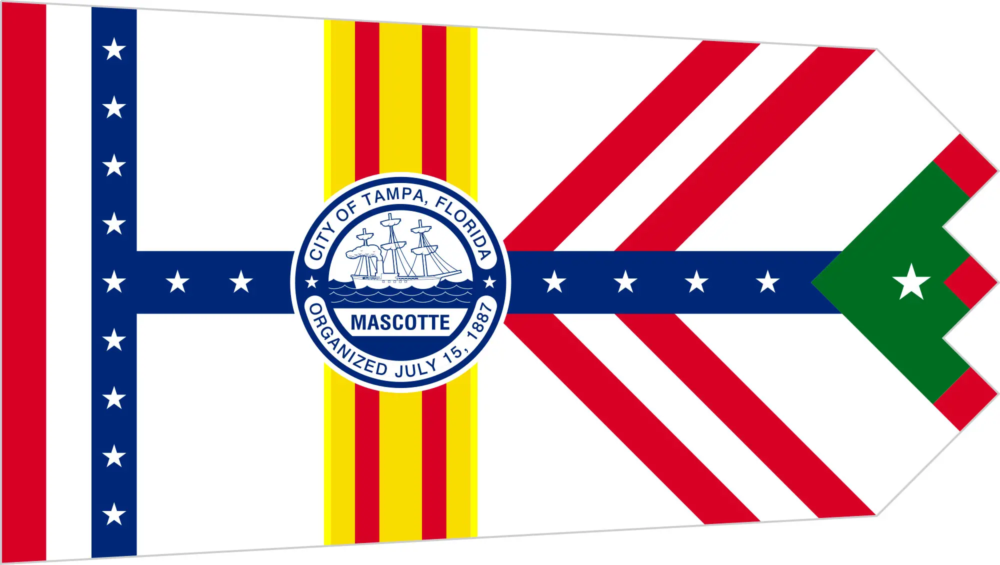
It’s hard to figure out what’s going on here on first — or 2,000th — glance. But basically, it seems they just mashed up a bunch of other flags into a non-rectangular shape. Why do this, Tampa? They’ve got a whole pirate motif thing. Why not just go with the Jolly Roger flag and, oh I don’t know, slap a palm tree and a jetski on top of it and call it a day?