My friend Paul drops by and shares the most melodramatic signs on the roads today.
In a delicious coincidence, my friend and longtime creative collaborator Paul (with whom I started PandaSmash.com, worked at Break.com, wrote and produced a play, wrote a screenplay, and more) got a book deal around the same time I got mine. And our books came out within a month of each other.
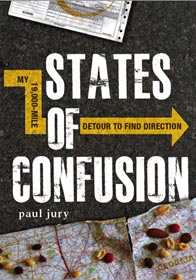
His book is called States of Confusion and details the 48-day, 48-state solo road trip he went on after finishing college. Therefore, when we discussed him doing a guest 11 Points, we focused it on travel.
During his drive he took photos of some of the more ridiculous signs he saw. And since I have a history of loving ridiculous signs (my 11 Most Stolen Street Signs in the U.S. (Because They are Cool or Funny) and 11 Businesses Selling Two Hilariously Unconnected Items still warms my heart), I jumped when he suggested using some of his sign photos for this list.
So here are 11 overdramatic road warning signs, ranked from least to most overdramatic.
Paul took some of these on his trip and found some others thanks to the magic of the Internet. As is the standard 11 Points guest list style, I’ve tossed in a few comments on these as well. Enjoy.
11 | Work Zone: Let ‘Em Live
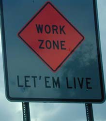
Paul: I took this picture in South Carolina, where construction areas seem to be less minor inconveniences and more opportunities to wantonly run down municipal workers.
Sam: I know the implication is that you’ll slow down to let the workers live but are the expectations of us SO low that the government thinks we’ll recklessly plow over people if we aren’t reminded not to? That would be like me putting up a sign right now about avoiding run-on sentences.
10 | Crazy swerving looms
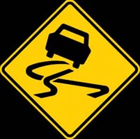
Paul: I guess this is a sign for a slippery road — or possibly drunk drivers — but really, the phrase “getting my swerve on” is what sticks in mind most.
Sam: I think that car is doing the criss-cross moment from the Casper Cha Cha Slide. Part two, I believe.
9 | Bike ejections forthcoming
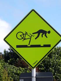
Paul: I’m not sure if this was posted above trolley car tracks, some kind of Oregon-Trail-esque wagon-rut path, or just a really terrible road. Whatever it is, crossing it via bicycle will really own you.
Sam: This is why I never ride my bike on Lincoln Logs.
8 | You Can Die
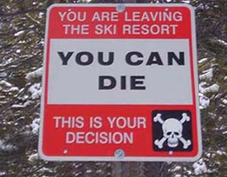
Paul: As much as it may be a little over the top, one has to admire this sign for its blunt honesty. It IS your decision, after all.
Sam: But sometimes you have to risk your life and ski the K12. The only way to truly defeat a bully is to beat him in a skiing race.
7 | Splatter Zone
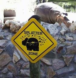
Paul: The first of our “beware of animals” series, this, obviously, is not an American sign. Unless it’s in the hippo fallout section of the San Diego Zoo. It does remind me of some of the signs in Africa, right next to the ones warning you that the blue-assed monkeys will tear your ears off.
Sam: When I was growing up, there was actually a place called the Splatter Zone where kids would paint ceramic molds. And, fittingly, a lot of us would add brown splatter paint to the back end of the animals.
6 | Now that’s an avalanche
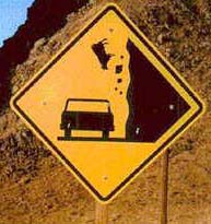
Paul: CAUTION: Driving in this area leaves you vulnerable to avalanches, falling cows, and driving a ’67 Studebaker.
Sam: What if this sign was just accidentally posted 90 degrees wrong? If you give it one turn clockwise it’s like someone’s flying a flag over the ocean while a cow goes for a swim.
5 | The world’s meanest moose
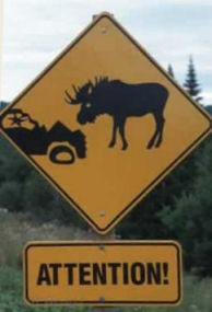
Paul: The moose in this area will not only wreck the hell out of your car, but then stare you down for being a little bitch.
Sam: If a moose charges at me straight from the gates of hell, I don’t think I’d need a sign to tell me to pay “ATTENTION!”
4 | Hang on tight
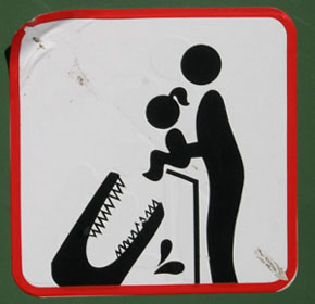
Paul: What’s scarier than the on-the-nose “Don’t feed your baby daughter to the alligator” thing is… that I’m not sure that’s an alligator. Perhaps “Don’t feed your daughter to the eyeless, remorseless, toothy Death Monster”…? Either way, nightmares.
Sam: Plus, years down the road, this opens your daughter up completely to being fooled by Peter Pan and an alarm clock.
3 | Isn’t “semi-permanently” an oxymoron?
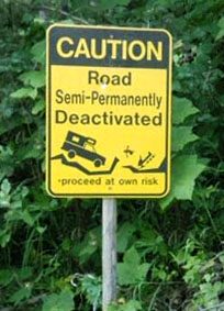
Paul: A sign with so much going on that I don’t even know where to start. “Semi-permanently”? “Deactivated”? A snow-mobile? Was there an earthquake? I think if this is the condition your road is in, the sign should just read “Road Closed.”
Sam: This is why I would never pay a sign manufacturer by the letter. And why I’d provide by own clip art.
2 | Time to reinforce the pier
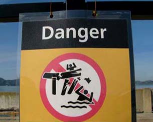
Paul: Indeed, DO NOT do this.
Sam: I don’t have the greatest graphic design skills in the world, but I certainly wouldn’t have let this one go to the printer with all of the action happening in front of the red circle with the line through it. I know it would’ve blocked most of the action to have the layers in the proper stacking order but that’s a fundamental design flaw. Which leads me to believe the people who were responsible for the sign were also responsible for the structural integrity of the pier.
1 | Someone cut the brakes?
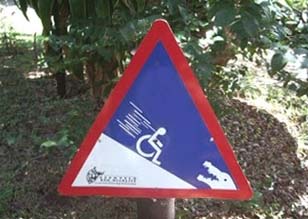
Paul: Another animal one, but how could I not? It’s not enough that there’s a handicapped person slipping down an incline — there also has to be an alligator. And speed-lines.
Sam: It’s either a sign for the world’s most dangerous place to take your handicapped family member or one pointing fans in the direction of the most extreme Special Olympics event ever.
—
Check out Paul’s book, States of Confusion, on Amazon. And also, if you haven’t gotten my book yet, please note that the two of them add up to just a few cents over the $25 free shipping plateau. It’s fate, man.