Comic Sans, arguably THE most hated font in the world, has quite a backstory.
Comic Sans. Two words that cause more horror in the eyes of designers than a mash-up of Microsoft FrontPage and Paranormal Activity.
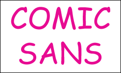
For those who aren’t that special kind of nerd that makes font jokes (I, by the way, am one of those kinds of nerds) — Comic Sans is arguably the most hated font on the planet. It’s intentionally cartoonish (which makes it feel out-of-place in 99 out of 100 uses), it looks cheap… and over time, it’s come to be the two-word summary of all amateurish print, web and church picnic flyer design.
I decided to take a deeper look into Comic Sans. It’s like inviting the goofy-looking new kid to sit at your table in the lunch room.
1 | It only exists because of Microsoft’s failed Bob project
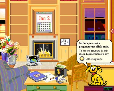
In the mid ’90s, Microsoft realized that there was something stopping the average American from buying a computer: They were just too darn complicated. I mean, between figuring out Lotus Notes, learning to use a trackball, and having to make the Sophie’s Choice between Prodigy and CompuServe, the complexity was really hurting business.
So they dreamed up Bob, a yellow smiley face wearing Bill Gates glasses, who’d help guide novice computer users and help them find things like a word processor. The whole thing was set up to look like a cartoon living room and featured a bunch of talking animals.
It was quickly discontinued for being condescending, bloated, unhelpful and just generally embarrassing.
Anyway, they had just planned on using Times New Roman or some other basic font for Bob and the animals’ speech balloons. A designer in Microsoft’s consumer division named Vincent Connare thought that was ridiculous — using grown-up fonts for cartoons — so he decided to create a more kid-friendly font.
Comic Sans was born. And even though Bob was discontinued before Windows 98 — after all, by that point they’d transitioned to a much-higher brow animated talking paperclip — Comic Sans survived and worked its way into being one of the Windows core fonts.
2 | It was inspired by Batman and the Watchmen
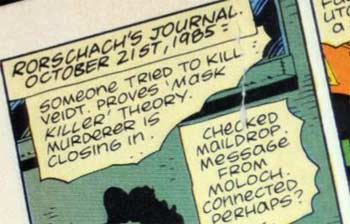
Connare says that he happened to have two comics in his office when he set out on his Comic Sans project: The Dark Knight Returns and Watchmen. So, he says, he’d look at the print in those books… then adapt their styles to make Comic Sans.
Huh. I guess the Watchmen movie was only the second-most hated thing to be adapted from the Watchmen book.
3 | The “Ban Comic Sans” movement is the strongest anti-font movement there is
I felt confident in calling Comic Sans the world’s most hated font because the proof is out there. On the Internet, where truth lives. Google “worst fonts” and Comic Sans tops almost every list. The website BanComicSans.com has spawned an army. The “Ban Comic Sans” online petition has almost 4,800 signatures.
The second-most reviled font, Papyrus, doesn’t have any petition to ban it. Not even after James Cameron used a slightly-modified version of it for the Avatar logo.
4 | It has found its way onto movie posters
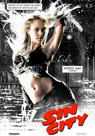
There’s Comic Sans saying naughty things about Jessica Alba.
Note that, in this instance, Comic Sans feels organic and completely un-distracting. In fact, I probably saw this poster in the wild back when Sin City was being promoted and my Comic Sans radar didn’t even go off. This point will come up a little later in the list but, basically, it shows that there are very, very specific ways that Comic Sans can be used in limited doses to enhance, not repulse. Basically, it’s like Gilbert Gottfried.
5 | Apple was so jealous of it they started using it, then ripped it off
It’s hard to remember now, but for about a decade Apple was a joke of a company… and seemed like it was about to follow Commodore and Tandy into the grave. Of course, since I’m typing this on a MacBook Pro right now and had two people drop calls to me today because they accidentally touched their new iPhones, they’re clearly alive and flourishing.
During Apple’s awkward phase between the Apple IIGS and the iPod (which would totally be narrated by Daniel Stern if it had been a sitcom), they grew so jealous of Comic Sans that they decided to swipe it. In 2000 they introduced free electronic postcards called iCards — and the default font was Comic Sans.
Once they finally got a brand identity again, they stopped stealing Comic Sans outright and created their own knockoff, called Chalkboard. At least they didn’t sell the font for $499 even though it’s missing crucial, fundamental features, like the letter J or a question mark.
6 | The guy who designed it also designed some other famous fonts
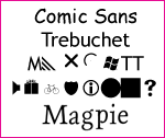
Connare’s only legacy isn’t Comic Sans — he also designed several other famous and better fonts.
Connare also designed Trebuchet, which is now standard on both Windows and Mac. He also created Marlett (a symbols font), Magpie and some of the Webdings.
To compare him, naturally, to Tom Green, Comic Sans is like his famous but derided, sophomoric major vehicle, Freddy Got Fingered… Trebuchet would be his creative peak, the episode of The Tom Green Show where he dealt with his cancer… Marlett would be the rest of his show, very hit-or-miss… Magpie would be something shockingly impressive, like marrying Drew Barrymore… and the Webdings would be like the time he humped a fish on spring break.
7 | He also has no sense of humor about the anti-Comic Sans movement
After reading his website and a few print interviews, it’s abundantly clear that Connare has no ironic appreciation of the journey of Comic Sans.
People don’t know why it was made. If they did they would realize that it was what design is about — designing for a product with an appropriate design. Not Times New Roman. They also need to pull their heads from their arses… it pisses me off.
He’s not embarrassed. He thinks it’s a good, well-designed font for kids and he doesn’t appreciate the wailing coming his way from hipsters and font snobs (you know, the types who read Ayn Rand’s The Font-ainhead.)
8 | The Wall Street Journal has actually used it for headlines
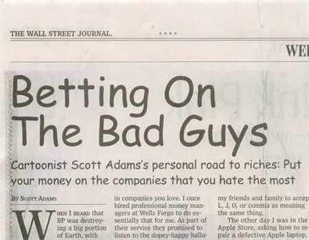
And I actually have visual evidence.
And sure, it was an article about comics, so I can see how the connection was made. But it does call into question the judgment of their designers. What’s next, putting in photos of people that aren’t turned into line art?
9 | It’s one of the top 11 fonts in existence
According to the latest stats, Comic Sans is available on 99.13% of Windows computers and 90.91% of Macs. That makes it approximately the ninth-most common font out there. (Probably in the world, but I don’t want to get blasted for being Anglo-centric, so let’s just say in the country. And maybe Canada outside of Quebec.)
Only an estimated 61% of Linux users have Comic Sans, by the way. Those Linux types are even more snobby. Reading Ayn Rand books like Prebuilt ATLAS Libraries Shrugged.
10 | If you want to buy it, it’s $30
So let’s say you’re one of the 0.87% of Windows users who doesn’t have Comic Sans. And you also happen to be a preschool teacher who desperately wants to print out a sign reminding kids to pick up their galoshes. What do you do?
Well, you’ll be happy to know Comic Sans is on sale… for $30.
Really. It’s not free. You have to spend money to get one of the most ubiquitous fonts… one that comes free with 9,913 out of 10,000 PCs. That’s like going on iTunes to buy an episode of a TV show that’s on Hulu. Or going to Staples to buy pens when you clearly work at an office.
11 | It’s showed up everywhere from Beanie Babies to Disney products to tombstones
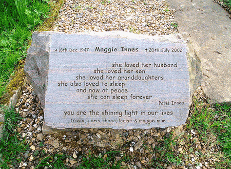
Remember Connare’s comment about using Comic Sans appropriately? As the official Beanie Babies font, yes. On Disney’s magazines? Sure. Etched on a tombstone? Uh…