The visually disturbing movie posters of the ’80s for One Crazy Summer, Conan, Star Trek IV, and more.
I went through at least 1,000 movie posters from the 1980s to pick the 11 for this list. It probably would’ve been fewer, but, because of the hip-hop world, there are at least 100 variations of the Scarface poster now cluttering up any ’80s movie poster repository.
I only realized them to be awfully bad after so many years when the really good ones came out. But back then, they’re kinda like okay because ya know, all of mankind’s creativity is poured into those visual styles that reflected the trends and tastes of the time.
Forty years later, it’s still grabbing attention and that’s why we have this list.
The worst 1980s movie posters
Here are the 11 worst posters from ’80s movies. No Scarface ones included. Some of these films opened on the same day as other movies but with better posters.
1 | Victory (1981)
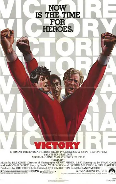
Truly one of the worst movie posters in the ’80s era. They’re trying to make the three leads form a “V”… but instead, it looks like all three are part of some freakish three-torsoed, Black Power-saluting hydra.
Also, the multiple spellings and translations of “VICTORY” in the background just look like typos.
2 | Superman III (1983)
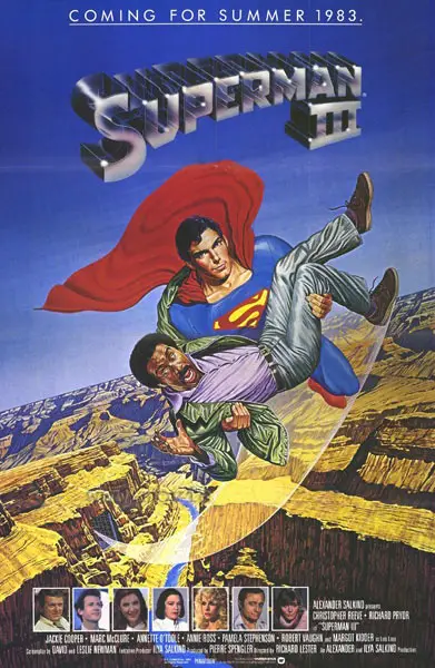
Yes, that’s Superman carrying Richard Pryor over the Grand Canyon. More than 25 years later, this almost seems like a joke, like something someone entered in a Photoshop contest where they replaced a comely Lois Lane with Richard Pryor. But it’s real. And ridiculous.
(I’m just a bit too young to remember the early ’80s but, based on what I’ve gathered, there was a brief period where Hollywood was determined to use Richard Pryor’s status and fanbase in the stand-up world to make him into a movie star. It never really worked. It’s exactly what happened with Chris Rock and, now, Dane Cook.)
3 | Soul Man (1986)
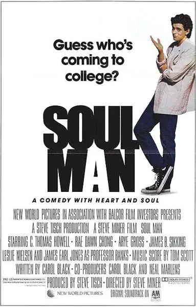
Soul Man is a really good high-concept comedy premise, with a white guy using tanning pills to turn himself black so he can get a free ride to Harvard. Of course, he finds out that being black is more than he bargained for. (That last line is really corny so you should read it in the “Rob Schneider is… a stapler” voiceover style.)
So why did the poster mention none of that and just chose to have mid-level movie star C. Thomas Howell stands there, in full-on honky mode, next to a completely irrelevant tagline? I have absolutely no idea.
4 | The Blue Lagoon (1980)
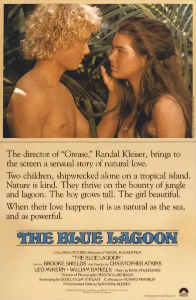
Opened on the same day as the Blue Brothers but this one has particularly the worse poster.
I guess it’s a good thing that, almost 30 years later, our societal sensibilities would never allow for a movie poster talking about “a sensual story of natural love [featuring] two children.”
I’m not a fan of the ongoing morality police/censorship culture that has been cultivated in the past six or seven years… but when it keeps stories like this from happening, maybe it’s not all bad.
5 | One Crazy Summer (1986)
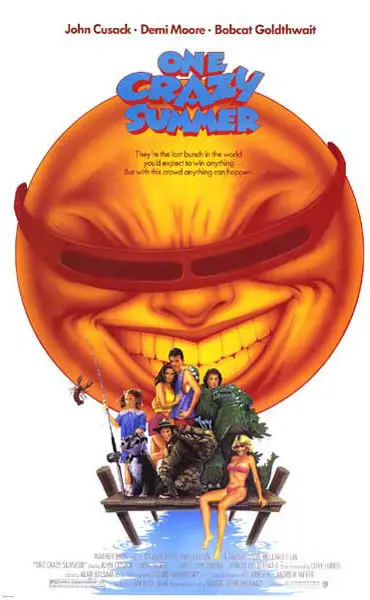
Of all the worst movie posters of the 1980s, this one gives me nightmares.
You have John Cusack, fresh off The Sure Thing and Better Off Dead… and you have Demi Moore, fresh off St. Elmo’s Fire and About Last Night… So what gets the focus on two-thirds of the movie poster? Why a hideous, gigantic, maniacally-evil cartoon sun that appears to be doing a Jack Nicholson impression, of course.
6 | Conan the Barbarian (1982)
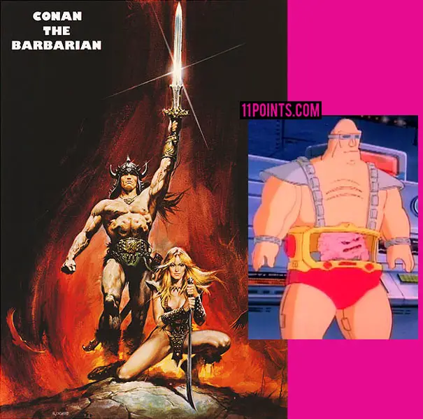
I get that Arnold Schwarzenegger is muscular. No one has ever denied that. But those are not natural abs. No one in history has had abs like that.
It looked to me like he has a giant brain in his stomach… which instantly made me think of Krang from Teenage Mutant Ninja Turtles. And to better flesh out that thought, I’ve included an insert of Krang in the picture below.
7 | Body Rock (1984)
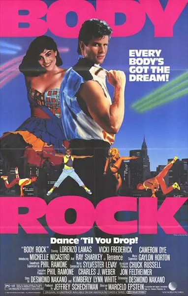
This movie poster contains the most simultaneous ’80s cliches of any poster from the entire decade.
The color scheme: Blue background with neon lasers and hot pink. (Not that I have any right to criticize hot pink, what with the design choices I made on my website, but whatever.)
Six people, each with an outfit more ’80s than the person before them. Breakdancing. People talking about dreams of dancing. And, most importantly, Lorenzo Lamas.
All that’s missing is Max Headroom drinking an Orange Julius.
8 | Star Trek IV: The Voyage Home (1986)
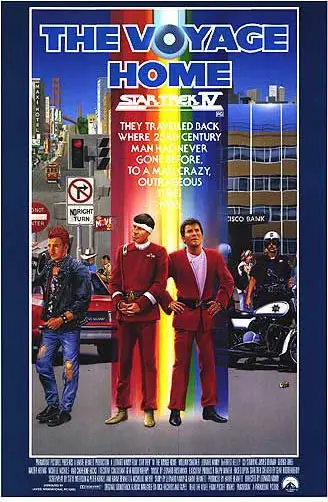
This poster actually made me laugh out loud. Spock and Kirk ride the rainbow to San Francisco, where they look around bewildered at the gays… that’s pretty freaking funny.
It’s still a hideous, over-the-top, awful poster in every way… but, on some level, it makes me want to go watch Star Trek IV for its sheer hilarity. And I never watch Star Trek movies.
9 | Raiders of the Lost Ark (1981)
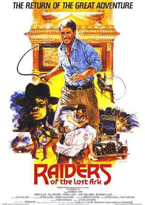
Apparently, for the first Indiana Jones movie, they thought it might be a good idea to market Indy as a clean-cut sales rep or Gap shirt folder who happens to hold a whip. Compared to other Indy film posters, this one is the worst.
I’ve seen some other posters for Raiders that use the correct Indiana Jones font and at least show him wearing a hat… possibly after this early poster made people wonder when Han Solo had time to go yuppie.
10 | Teen Wolf (1985)
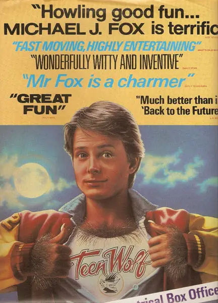
The corny double thumbs-up is pretty bad. The pre-Photoshop cartoonish airbrushing is the worst. But my biggest beef is with the marketing team having the audacity to say Michael J. Fox is better in Teen Wolf than Back to the Future.
I mean, really. Teen Wolf is camp. It’s funny in its absurdity, but it’s not, by any account, a good movie. I’m not sure how any poster idea for Teen Wolf could have been any worse.
11 | Teen Wolf Too (1987)
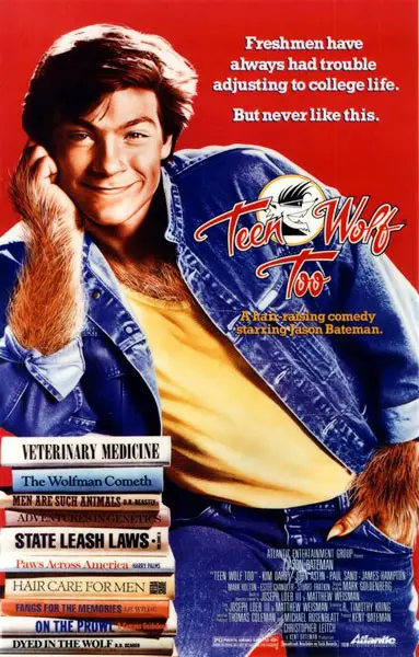
I stand corrected. This one’s the worst movie poster of the ’80s.